





SIDE PLAN
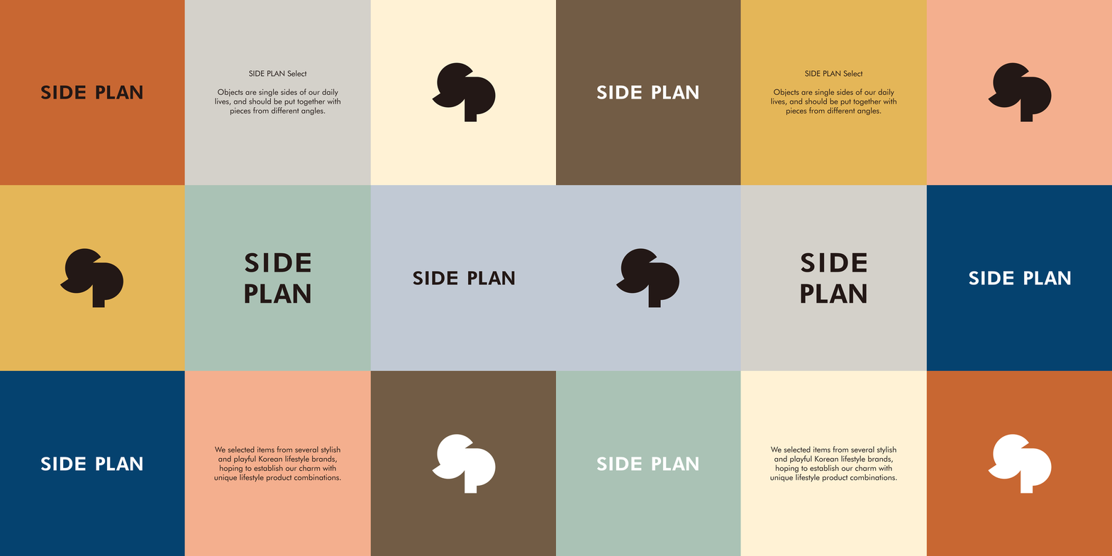
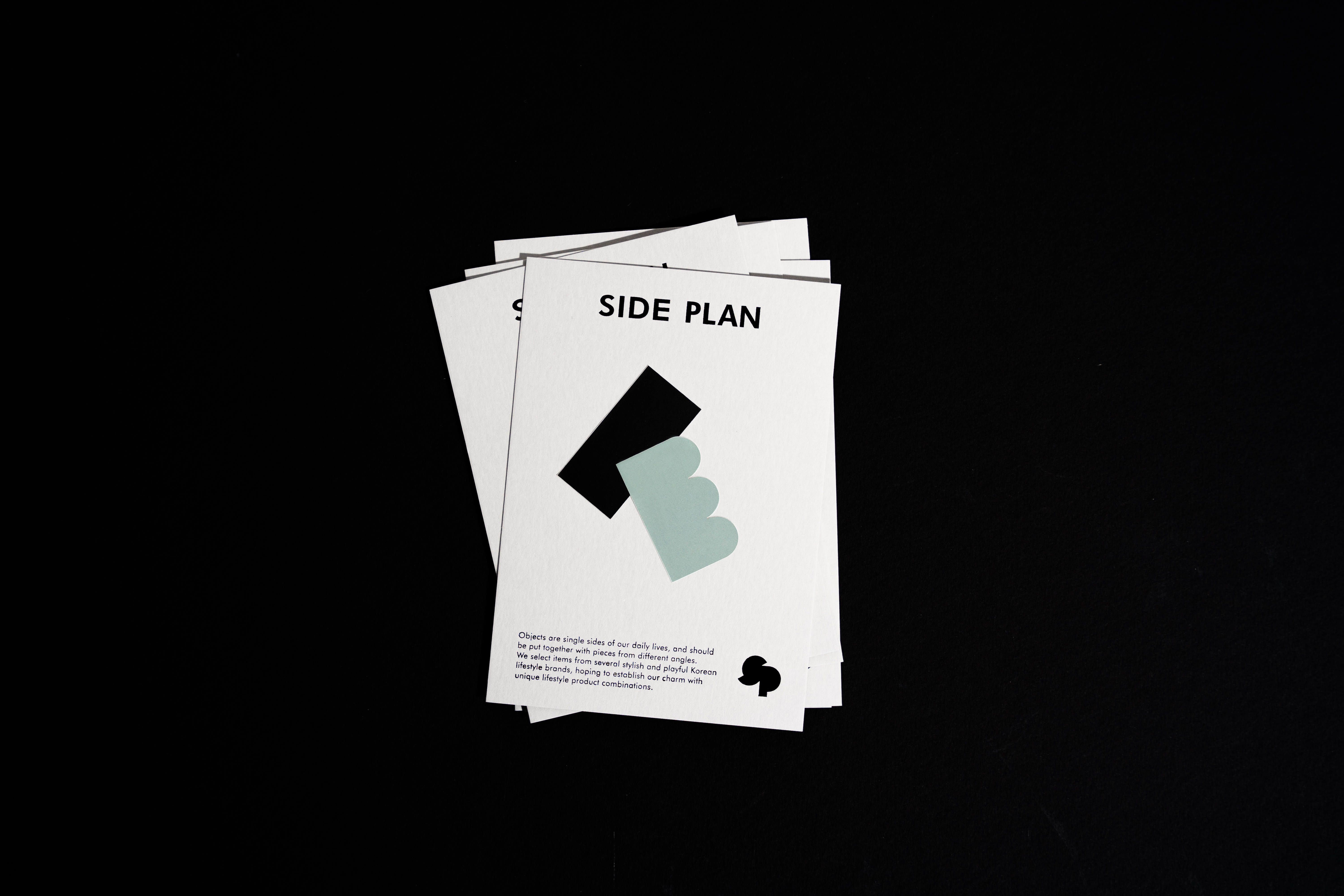
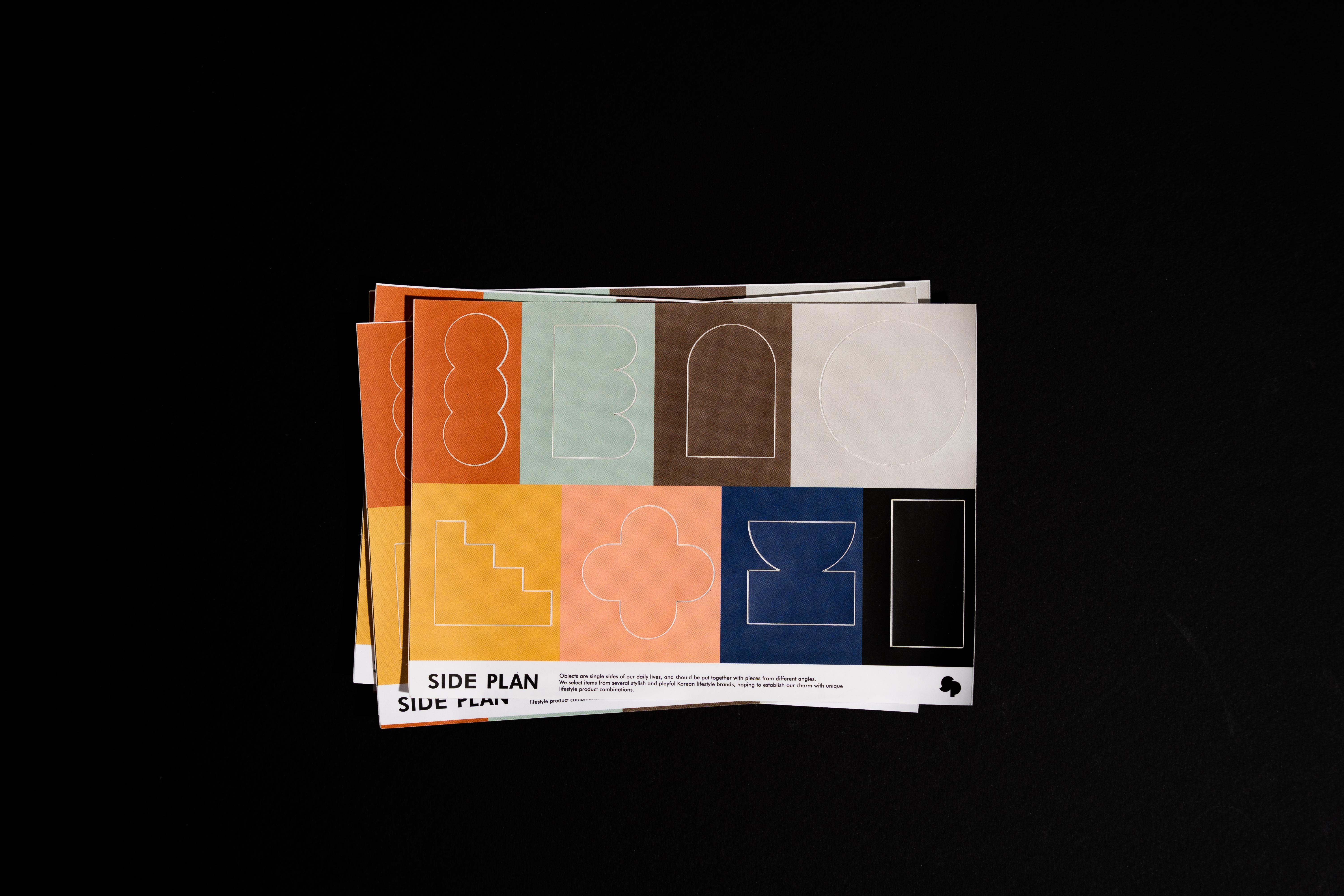
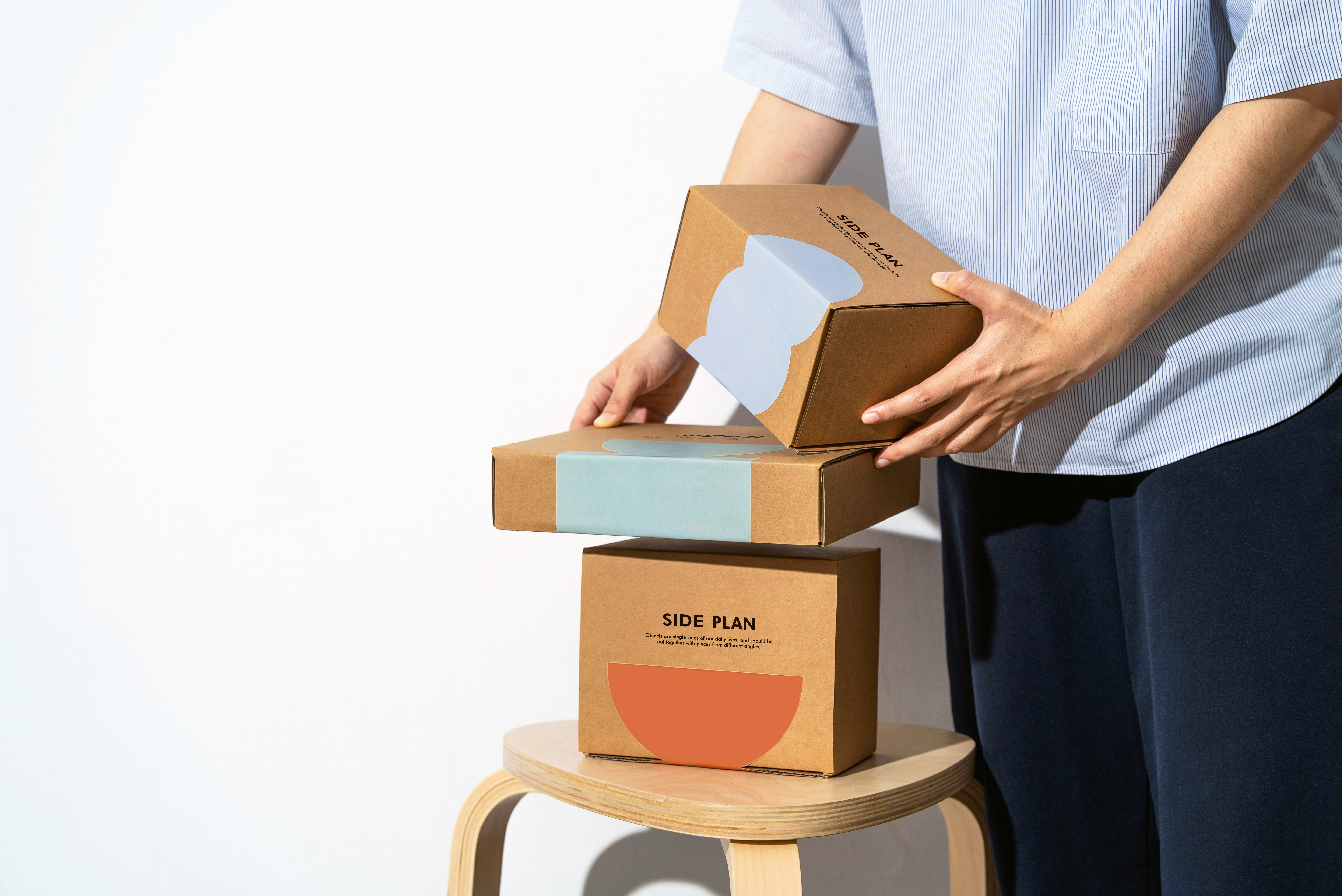
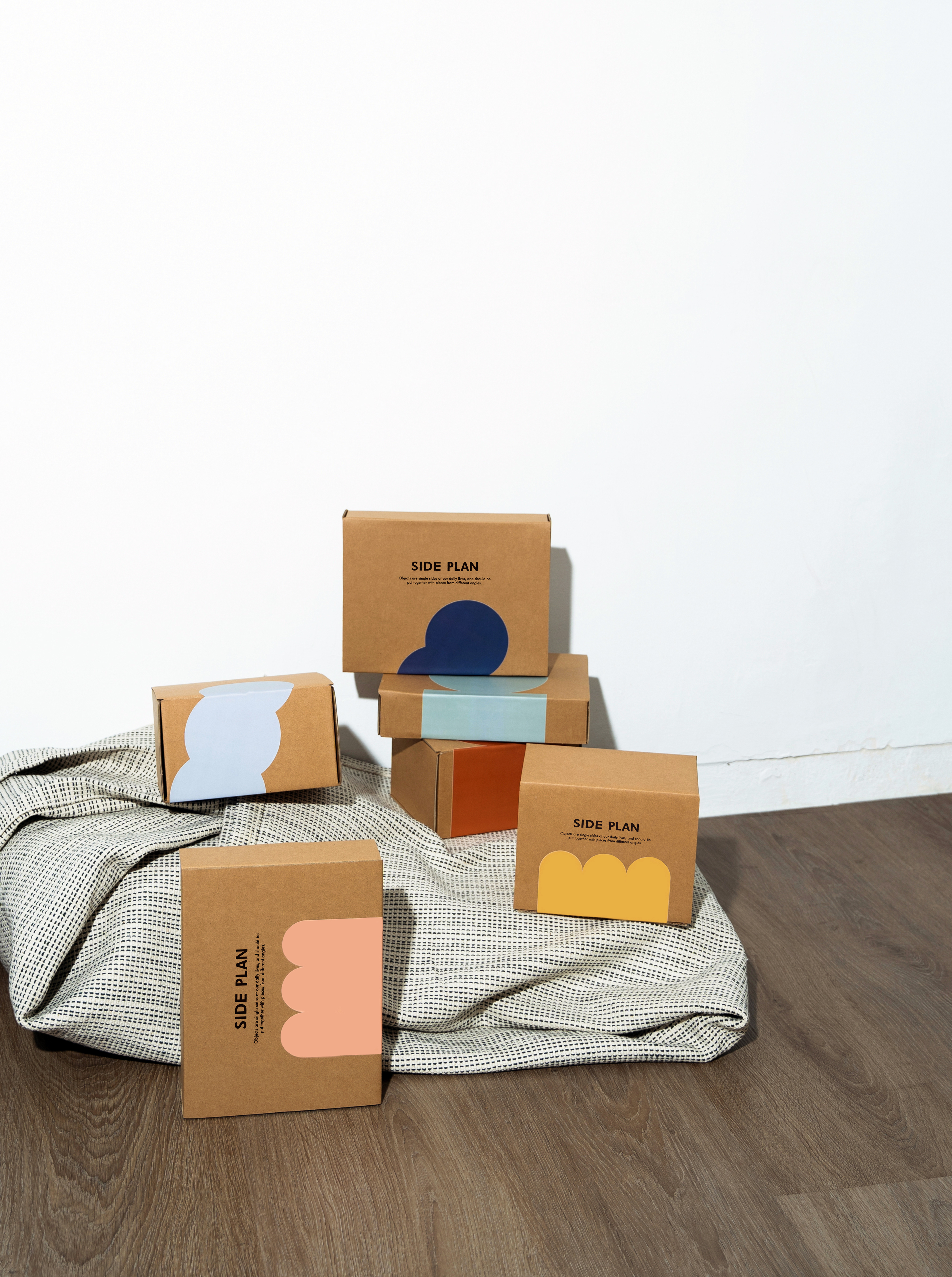
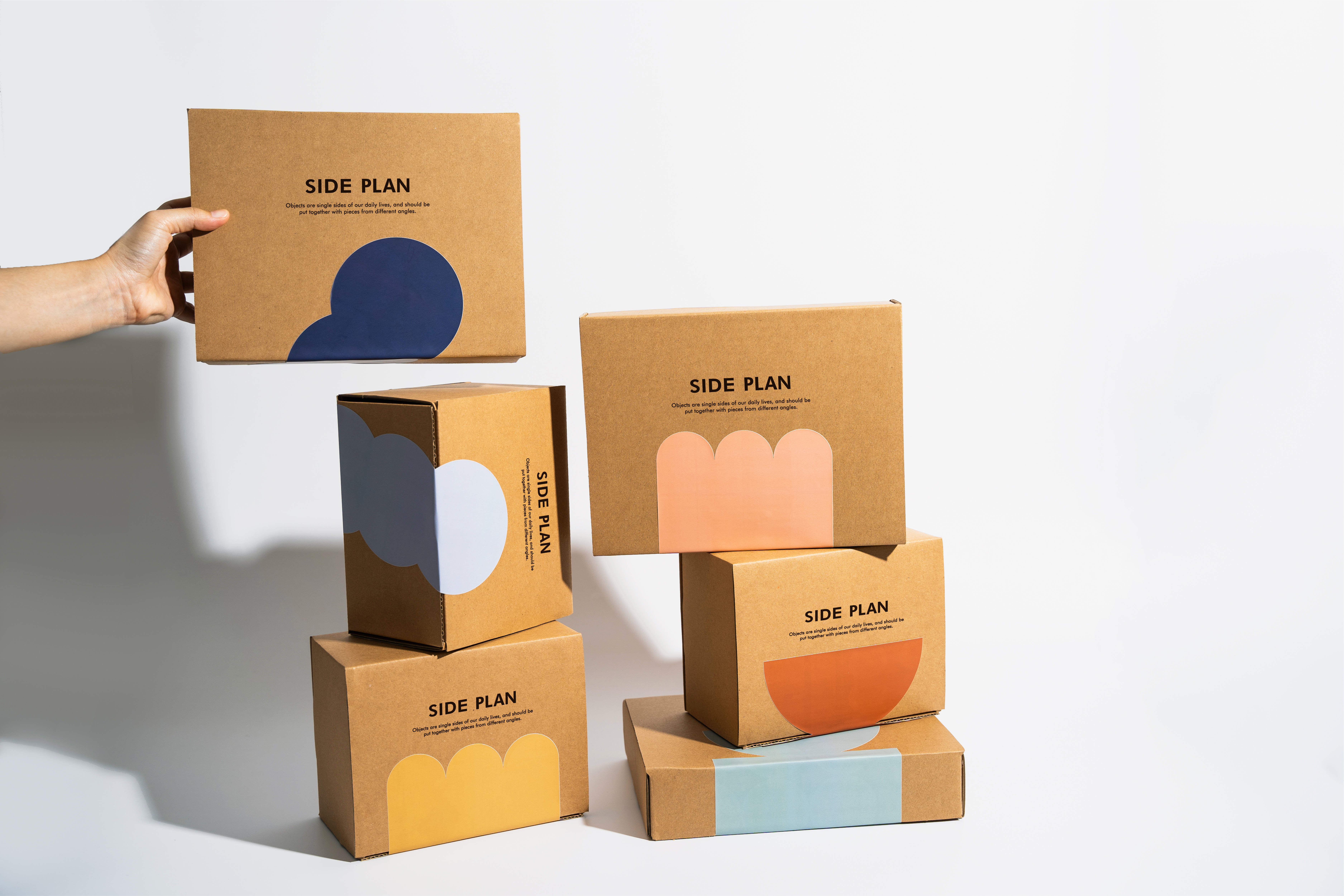
Side Plan 選物以側面圖的含義,象徵物件就像多種面向的生活切片來拼貼日常。品牌挑選了來自韓國不同的品牌,都是豐富配色且多樣有趣的商品,也希望帶來的這些商品可以增添生活中不同的趣味呈現。 設計理念上利用由S與P組成的logomark,從當中拆解出半圓型與長方形的形狀,進而延伸出多種可愛的圖案符號,同時設計成品牌貼紙,適用於出貨店卡及物流紙箱。
選物品牌需要乘載多種商品樣式,包裝較難使用單一尺寸或規格,也希望透過貼紙讓最基本的牛皮紙箱有多種的可能性,同時消費者收到每件商品都有不同的配色與圖案組合,不僅可以活用造型也可以營造視覺亮點,創造獨特且活潑的品牌魅力。
Objects are single sides of our daily lives, and should be put together with pieces from different angles. We selected items from several stylish and playful Korean lifestyle brands, hoping to establish our charm with unique lifestyle product combinations.
In the design concept, the logomark composed of S and P is used to disassemble the semi-circular and rectangular shapes, and then extend a variety of cute pattern symbols. At the same time, it’s designed as a brand sticker, which is suitable for flat cards and shipping boxes. The select shop brand needs to carry a variety of product styles, and it's difficult to use a single size or specification for packaging. It’s also hoped that the most basic kraft carton has a variety of possibilities through stickers. The consumers receive different colors and patterns for each product. This combination can't only use the shape but also create a visual highlight, creating a unique and lively brand personality.
C: SIDE PLAN
AD&D:YUF STUDIO
PH : Molly Lin
T:Branding、Packaging
Y:2022
AD&D:YUF STUDIO
PH : Molly Lin
T:Branding、Packaging
Y:2022