





SEESU 希宿
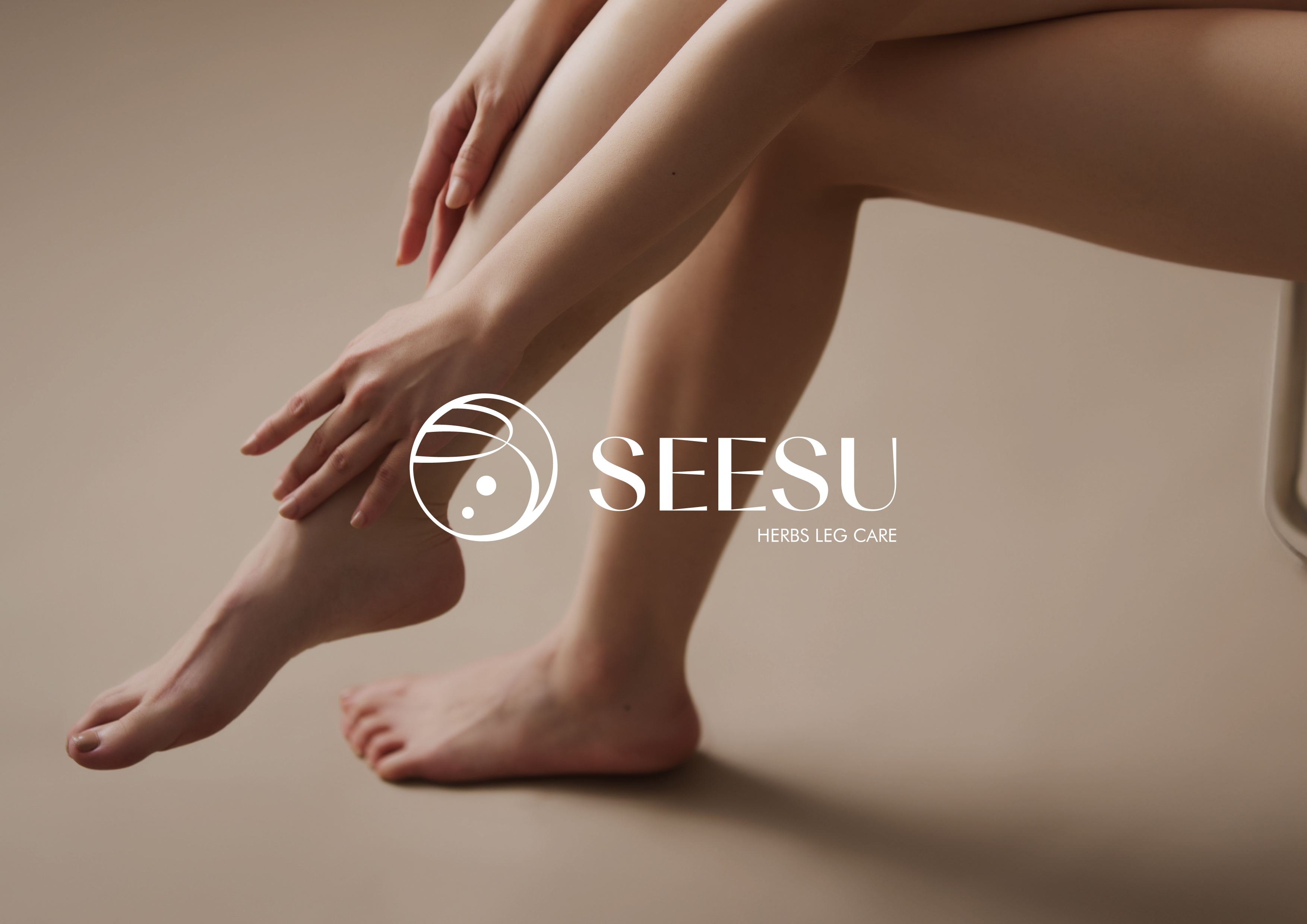
The foot is often considered the second heart of the human body. Our brand focuses on foot bath products designed to meet the needs of those seeking physical and mental balance and those looking to improve sleep quality. Through foot baths, we aim to bring moments of "healing sanctuary" to the busy daily lives of our customers. Additionally, our brand extends to foot care and maintenance products, striving to raise awareness about leg and foot health, emphasizing the importance of proper foot care.
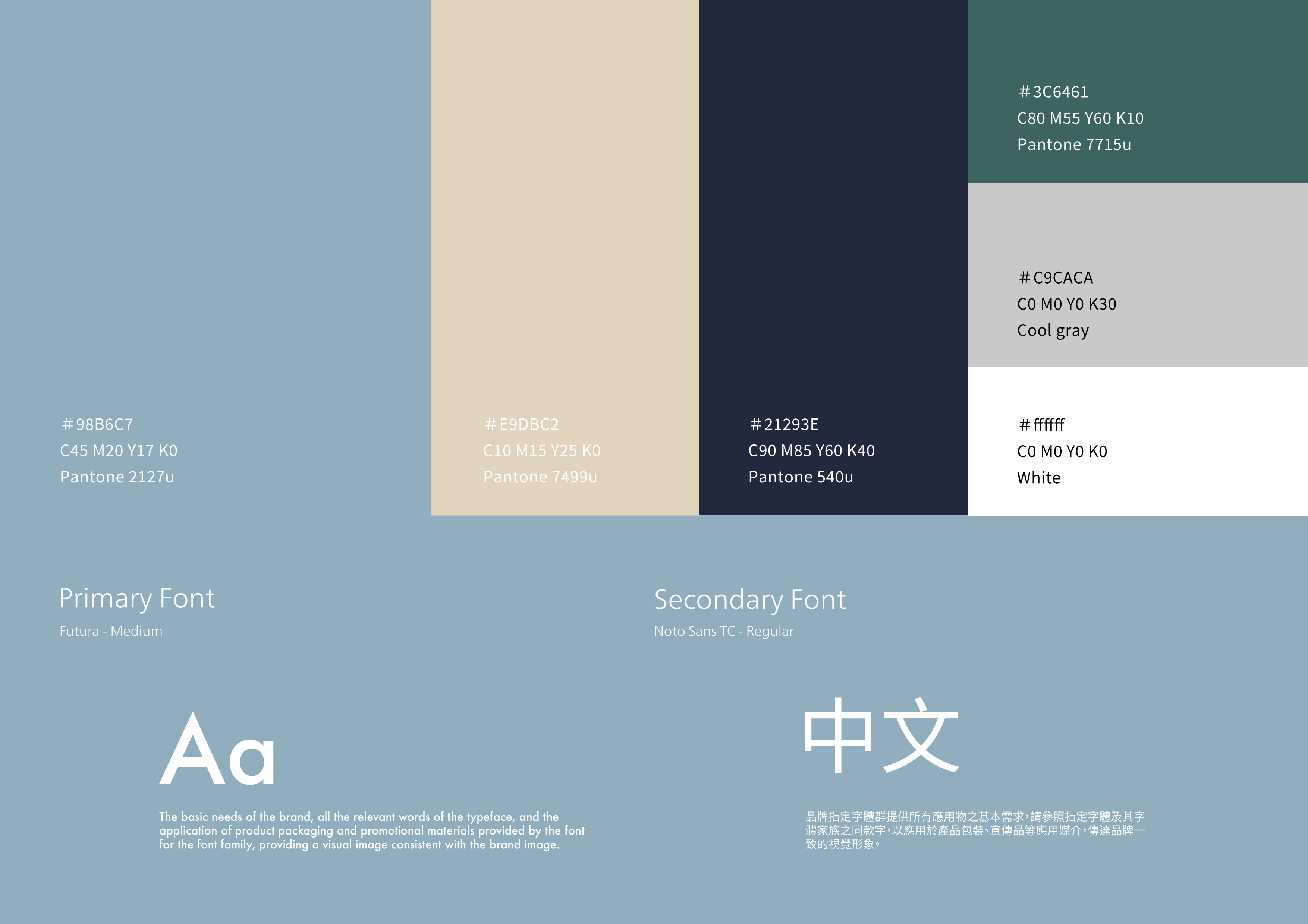
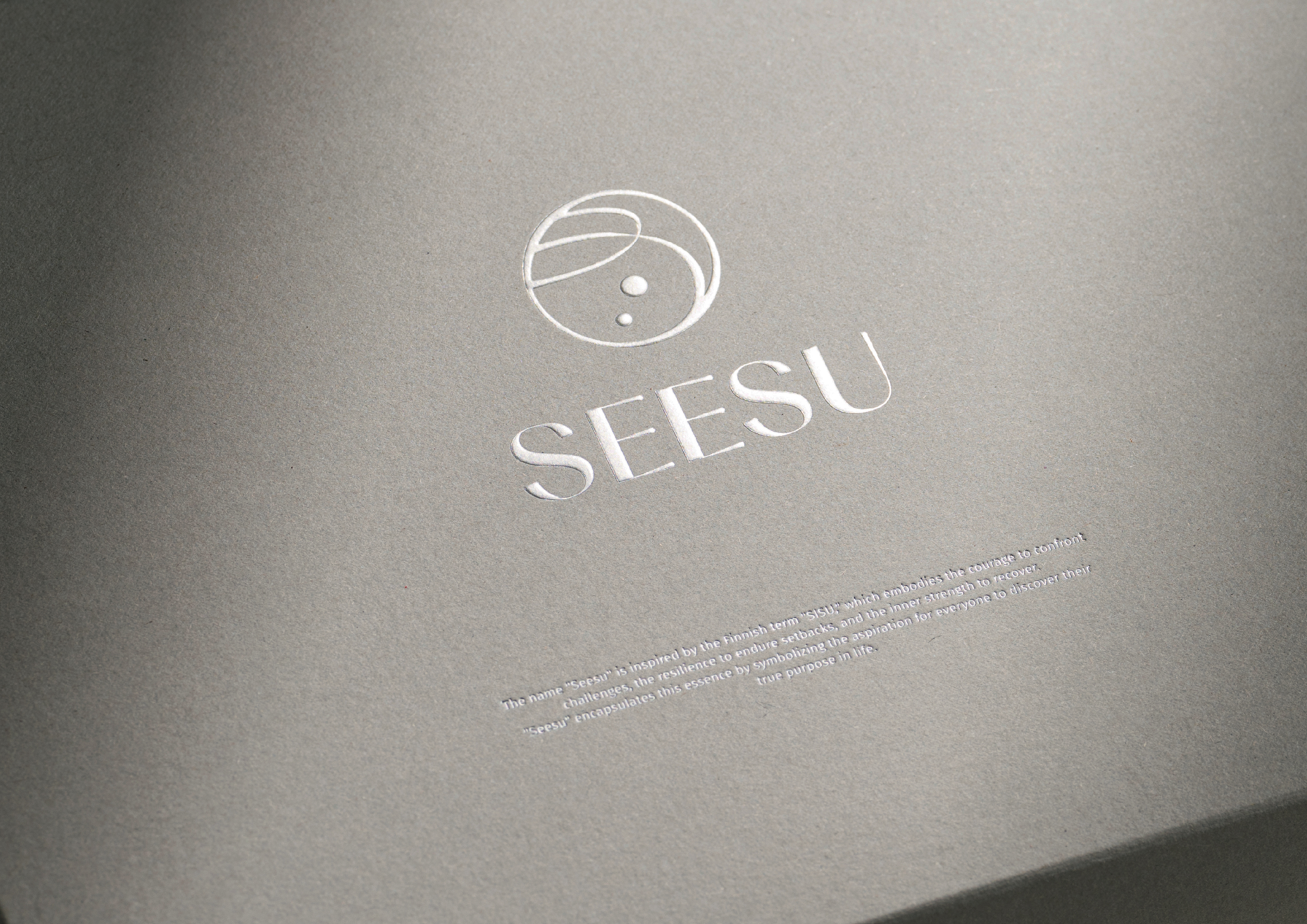
The design inspiration is derived from the brand name "希宿" (SEESU), transformed into the concept of "constellation." This symbolizes healing and relaxation of the body and mind, akin to the stars in the night sky providing warm guidance to weary souls. The brand's color palette features varying shades of blue, creating a comfortable and leisurely tone.
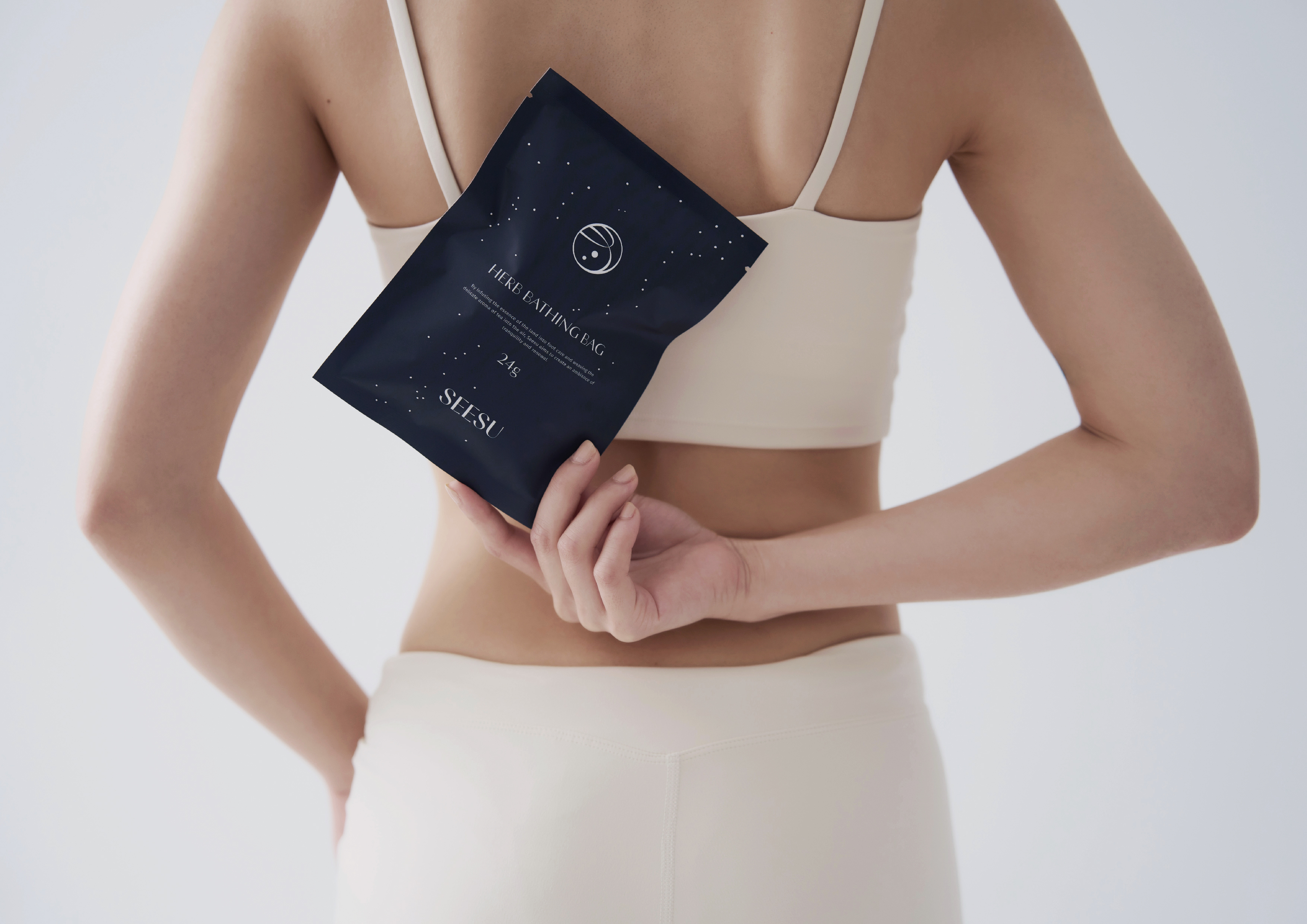
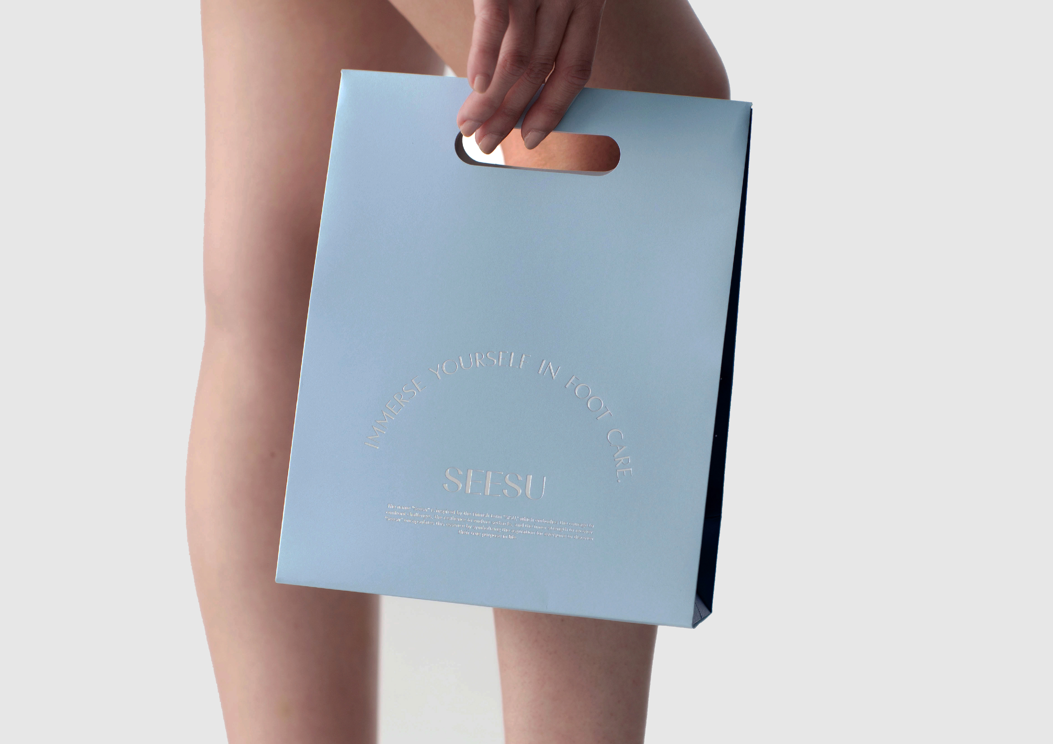
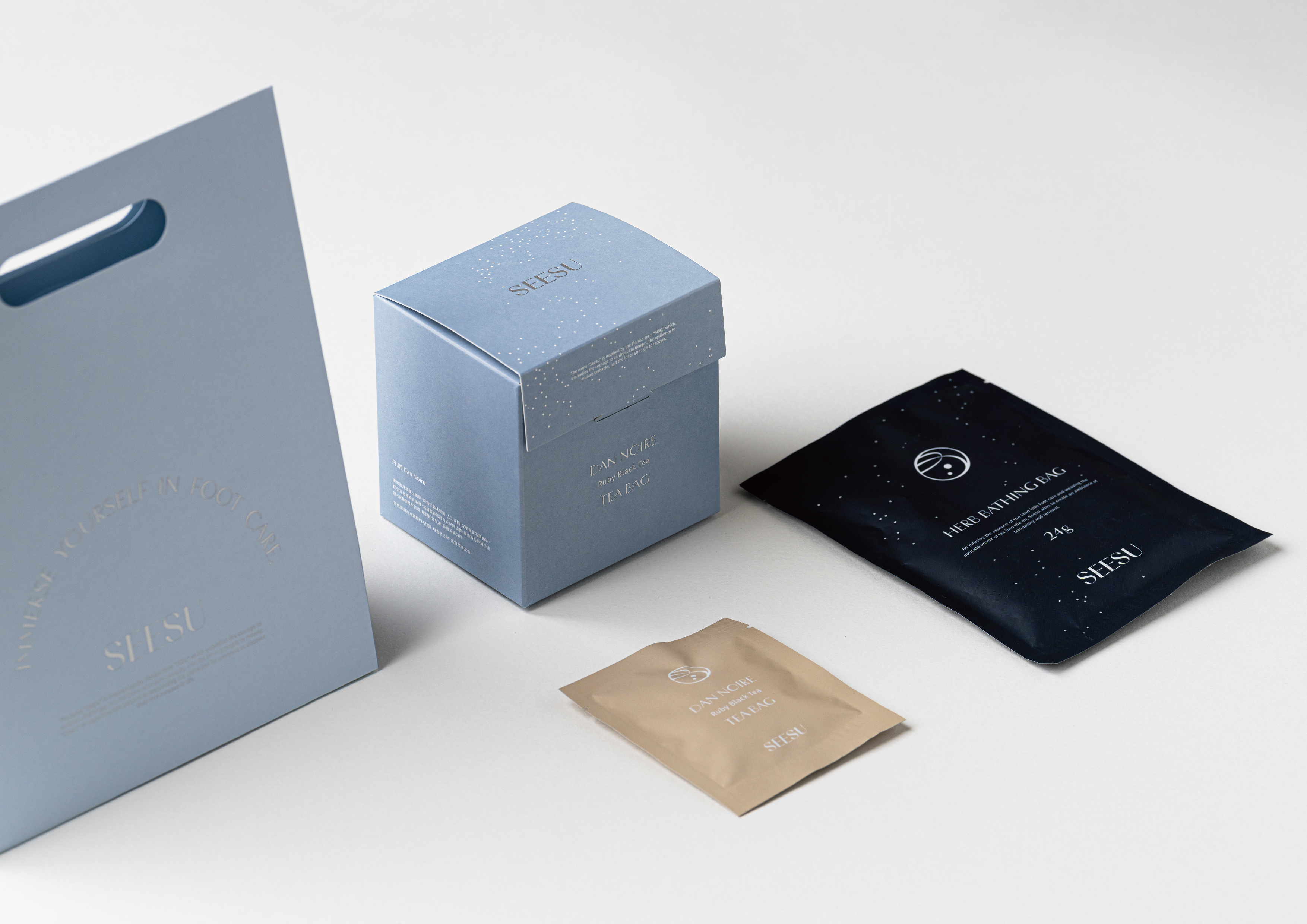
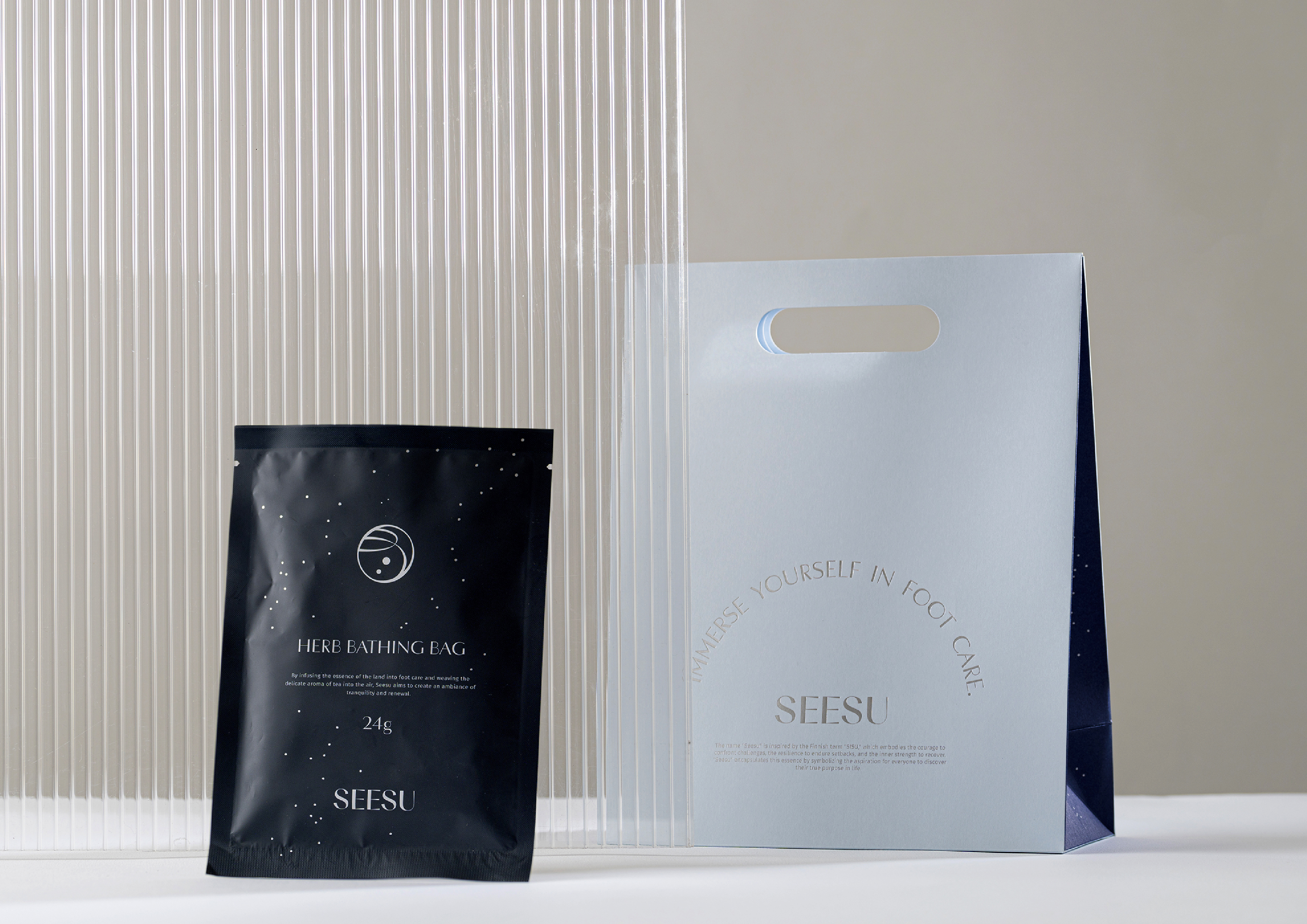
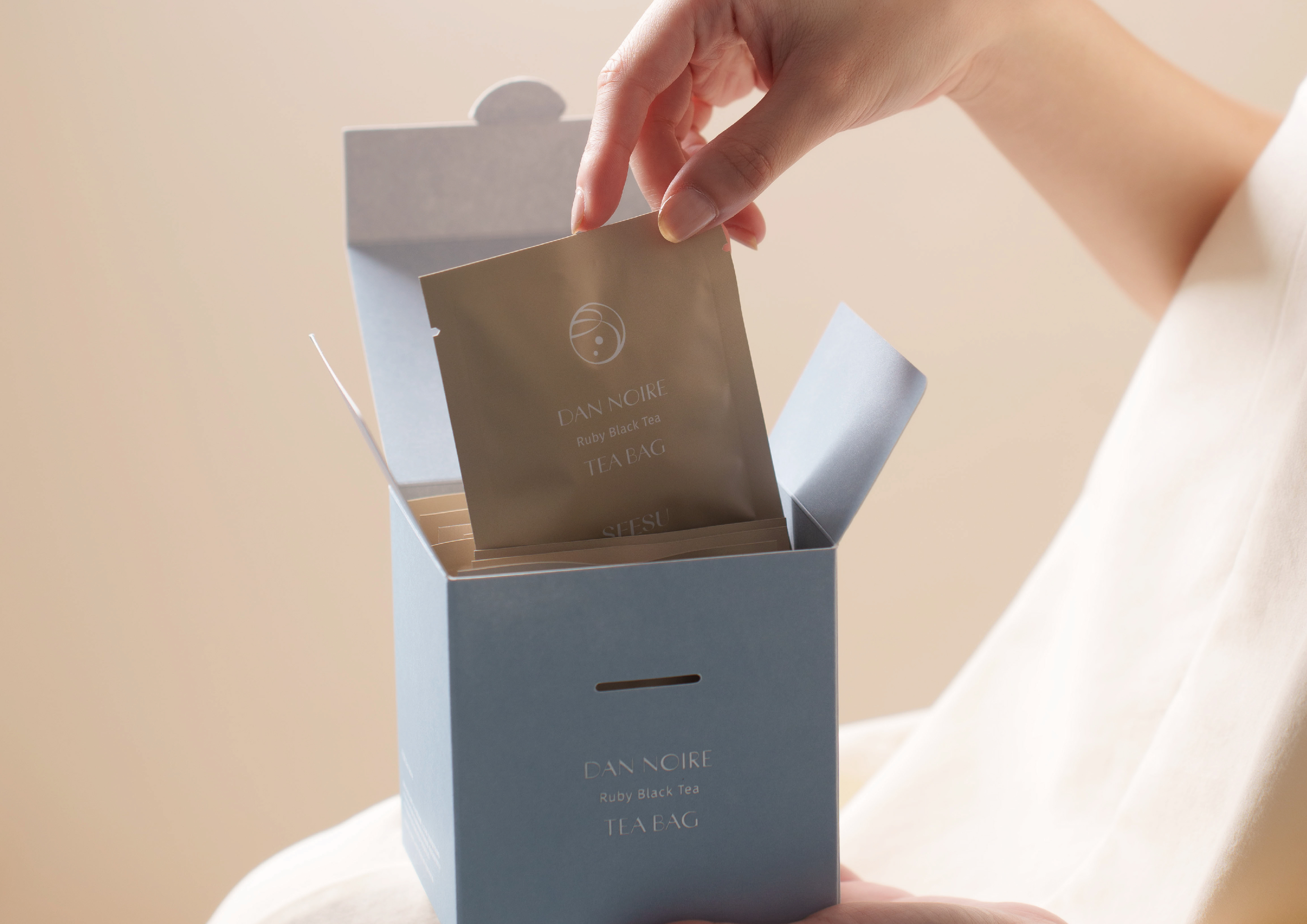
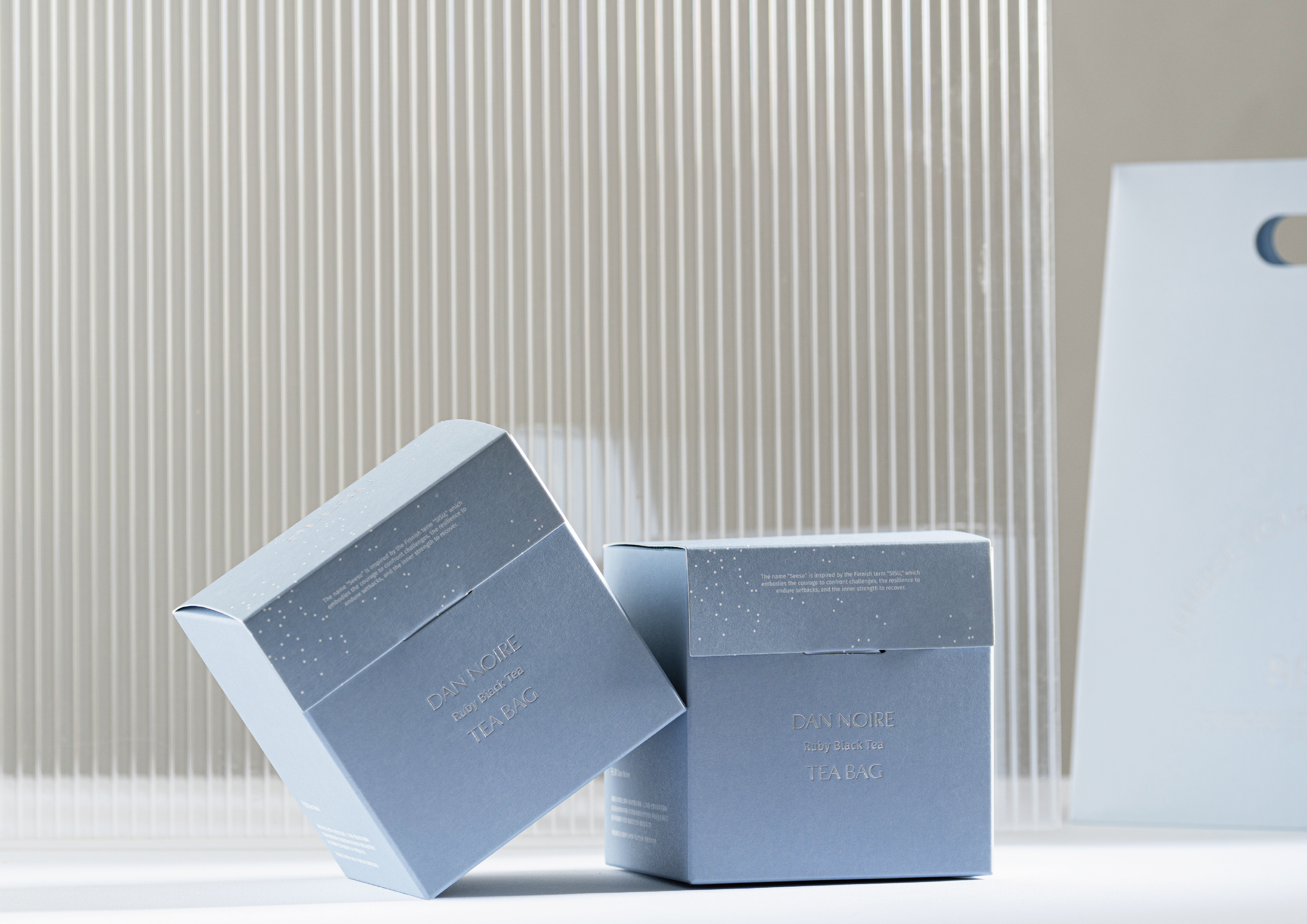
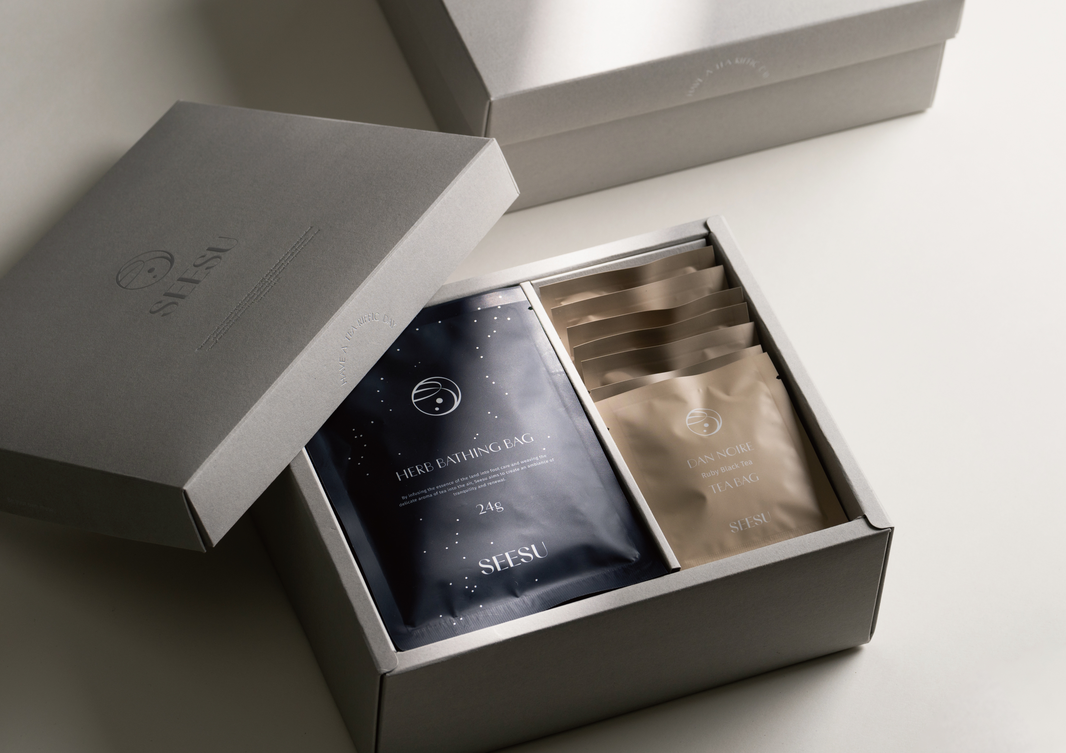
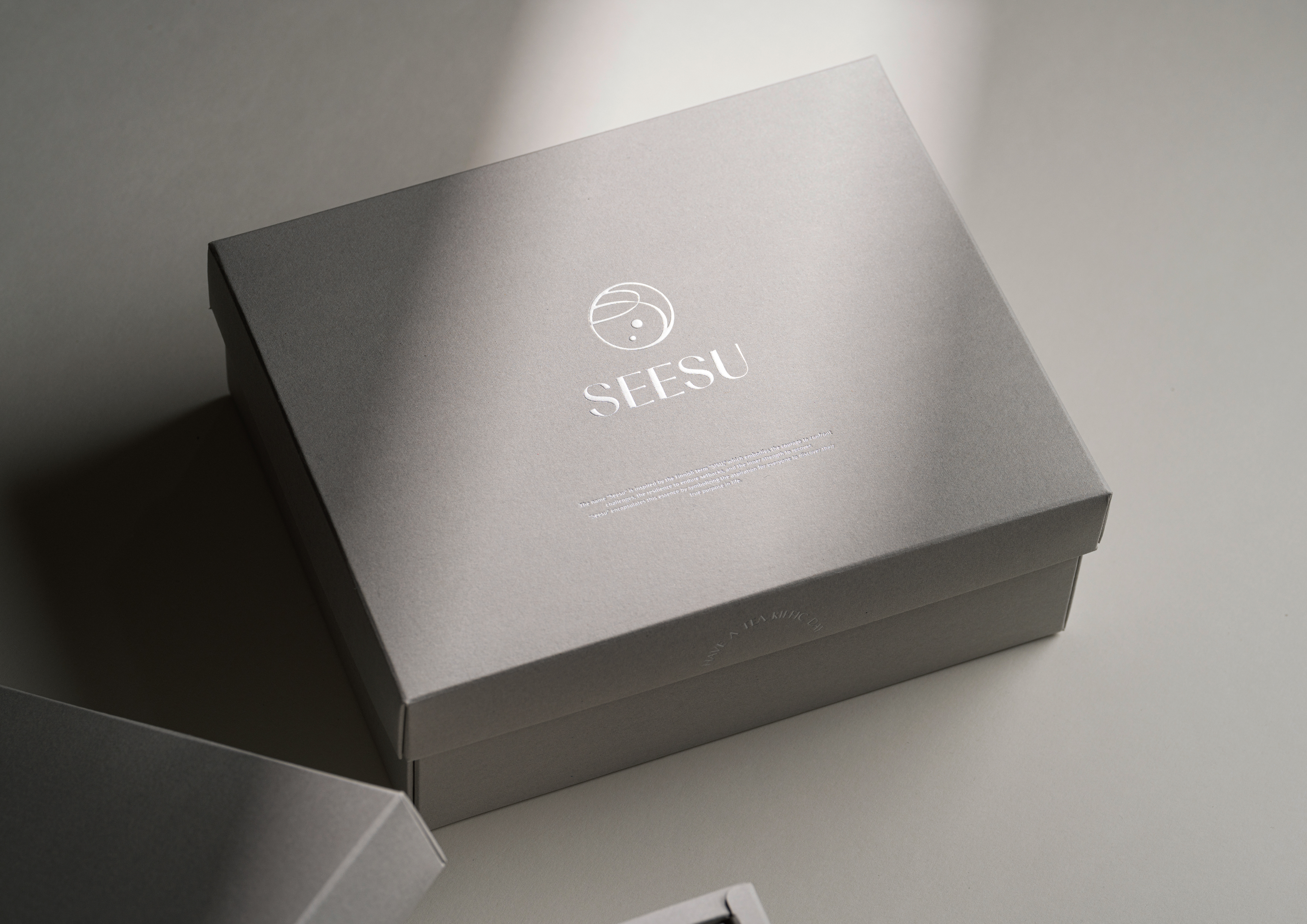
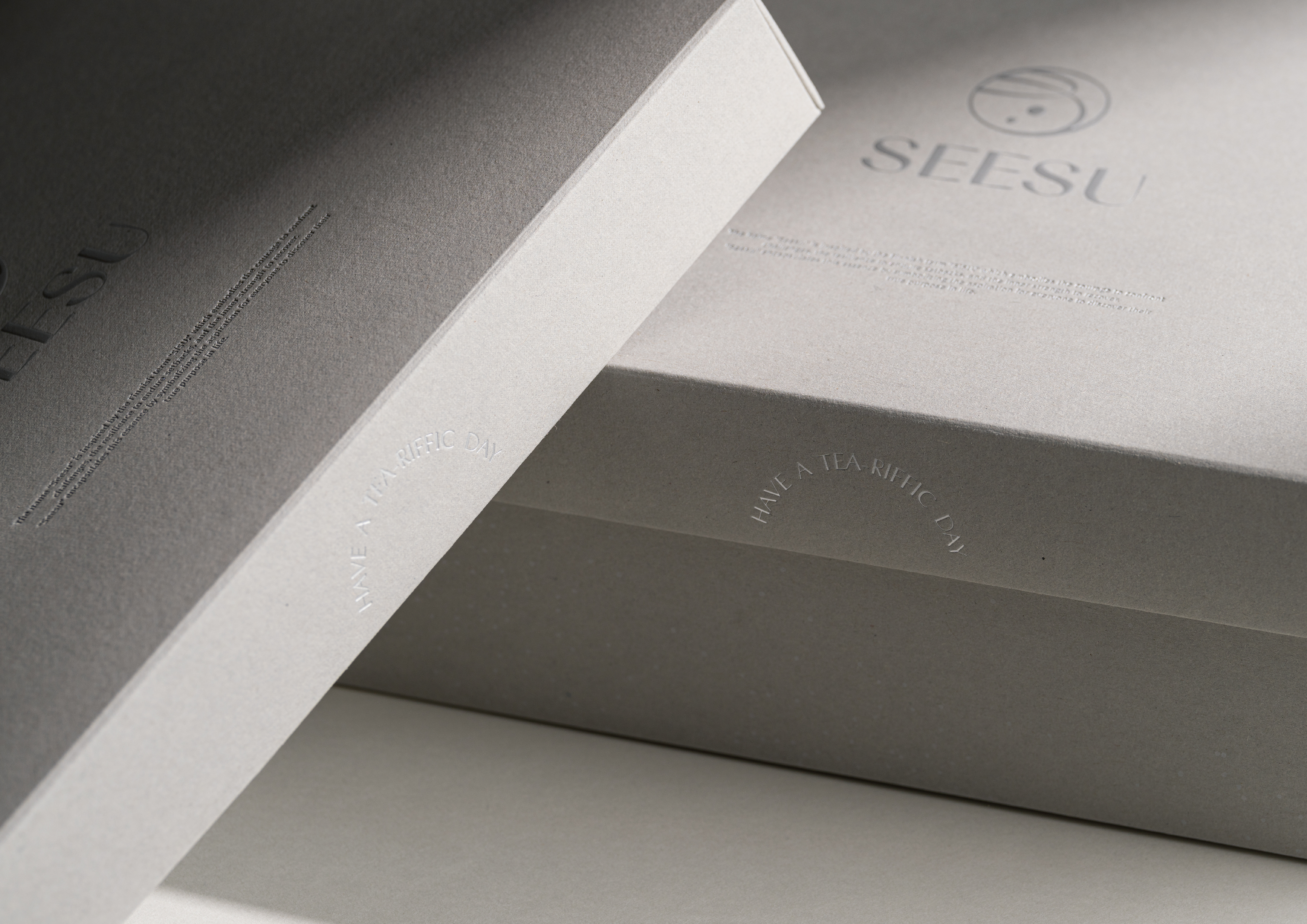
The packaging design distinguishes foot bath products and tea bag products using paper bags and boxes, respectively. With printing techniques like white ink and hot stamping, the design presents a starry pattern effect. The overall minimalist design, complemented by detailed embellishments, conveys the brand's gentle and healing atmosphere, making each use feel like a therapeutic experience under the stars.
足是人類的第二個心臟,品牌專注於足浴包產品,旨在滿足追求身心平衡和改善失眠的需求,透過足浴為忙碌的日常生活帶來「療癒棲宿」的時刻。此外,品牌也延伸至足部保養和護理商品,致力於提升大眾對腿足養護的認識,讓足部保養的重要性更深入人心。
設計靈感取自品牌名「希宿」轉化為「星宿」的概念,象徵療癒的身心放鬆如同夜空中的恆星,為疲憊的日常生活提供溫暖的指引。品牌配色以不同深淺的藍色為主,營造舒適、慵懶的調性。包裝設計利用紙袋和紙盒區分足浴包與茶包商品,並以白墨和燙銀等印刷工藝呈現星點圖案效果。整體簡約的設計搭配細節點綴,傳遞品牌溫柔放鬆的氛圍,讓每一次使用都如同置身於星空下的療癒時光。
C: SEESU
AD&D:YUF STUDIO
PH:db.workstudio、sinqa studio
T:Branding
Y:2024
AD&D:YUF STUDIO
PH:db.workstudio、sinqa studio
T:Branding
Y:2024