


NOOK COFFEE
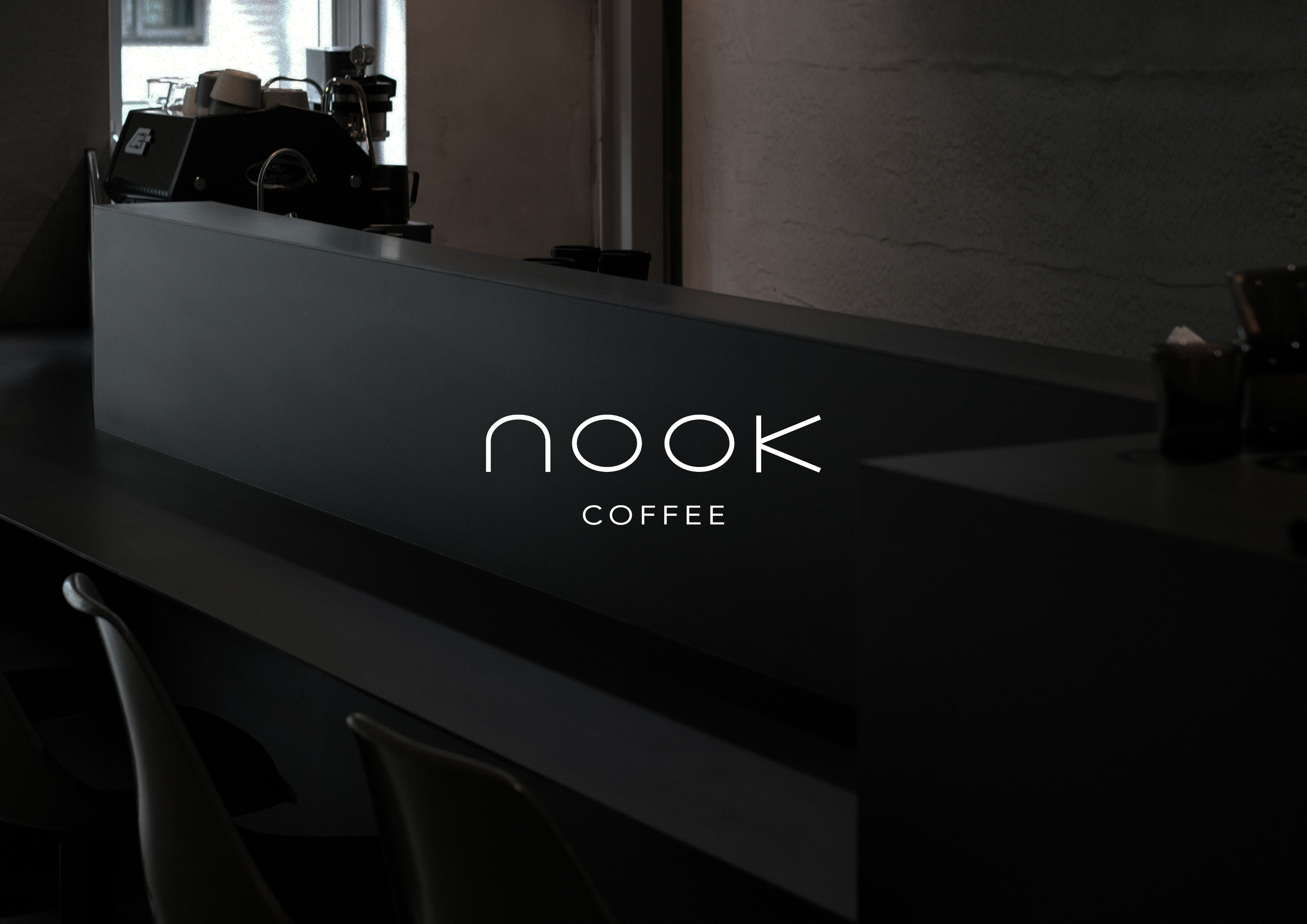
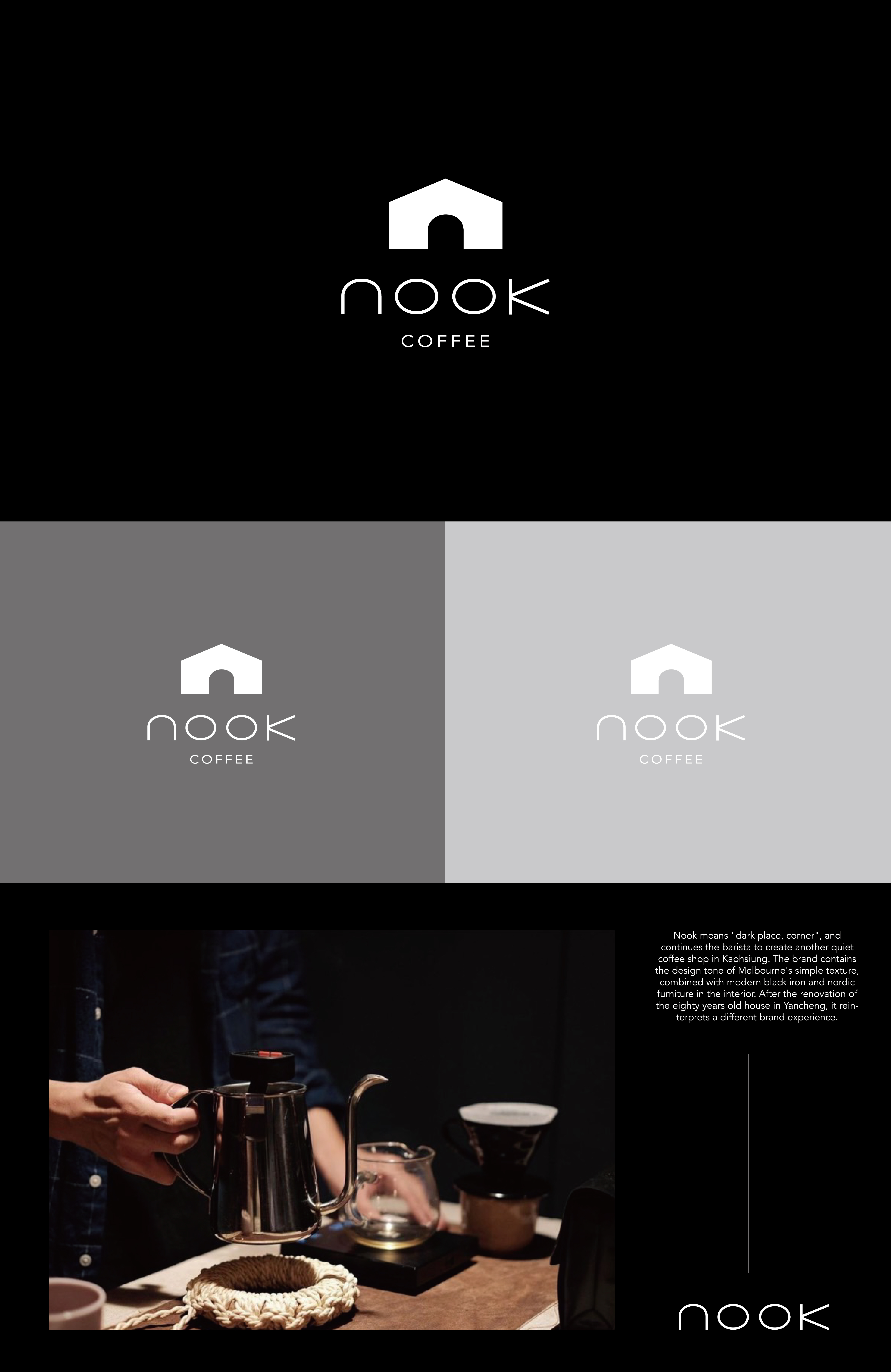
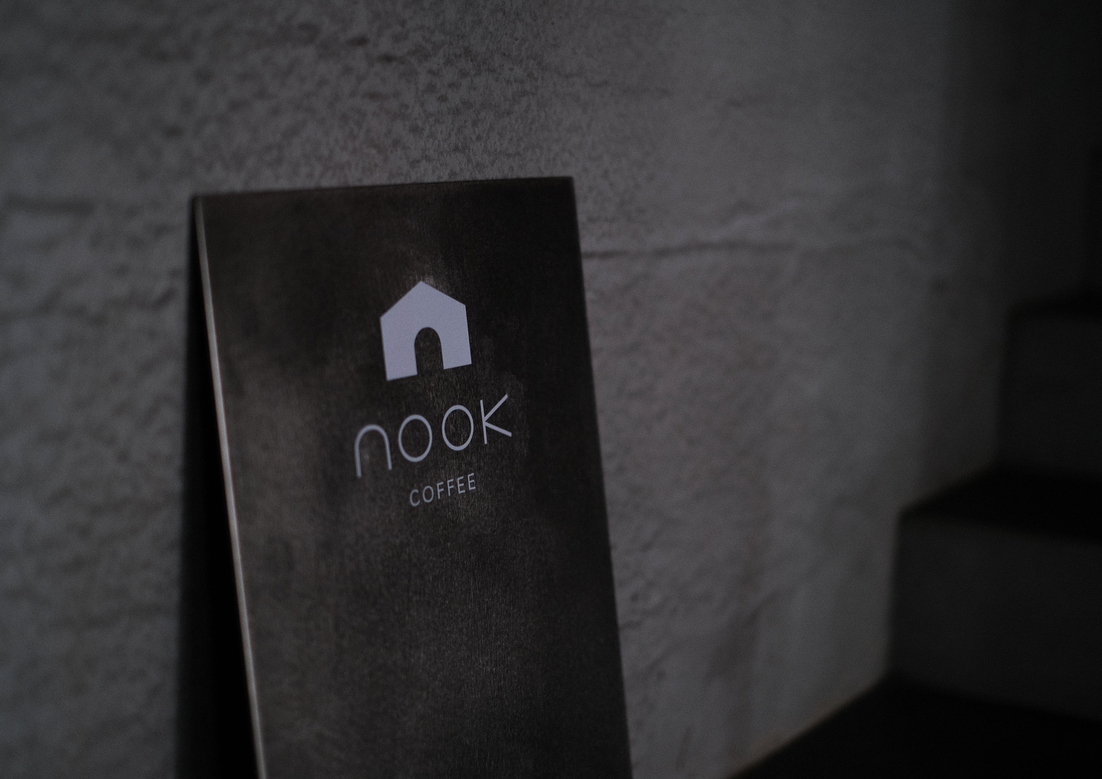
nook 是英文「暗處、角落」之意,延續咖啡師想在高雄打造另一處幽靜的新咖啡廳空間,品牌蘊含著墨爾本簡約質感的設計調性,室內結合現代風格的黑色鐵件與北歐傢俱,讓位於鹽埕的八十年老宅翻修後,重新詮釋不一樣的品牌體驗。
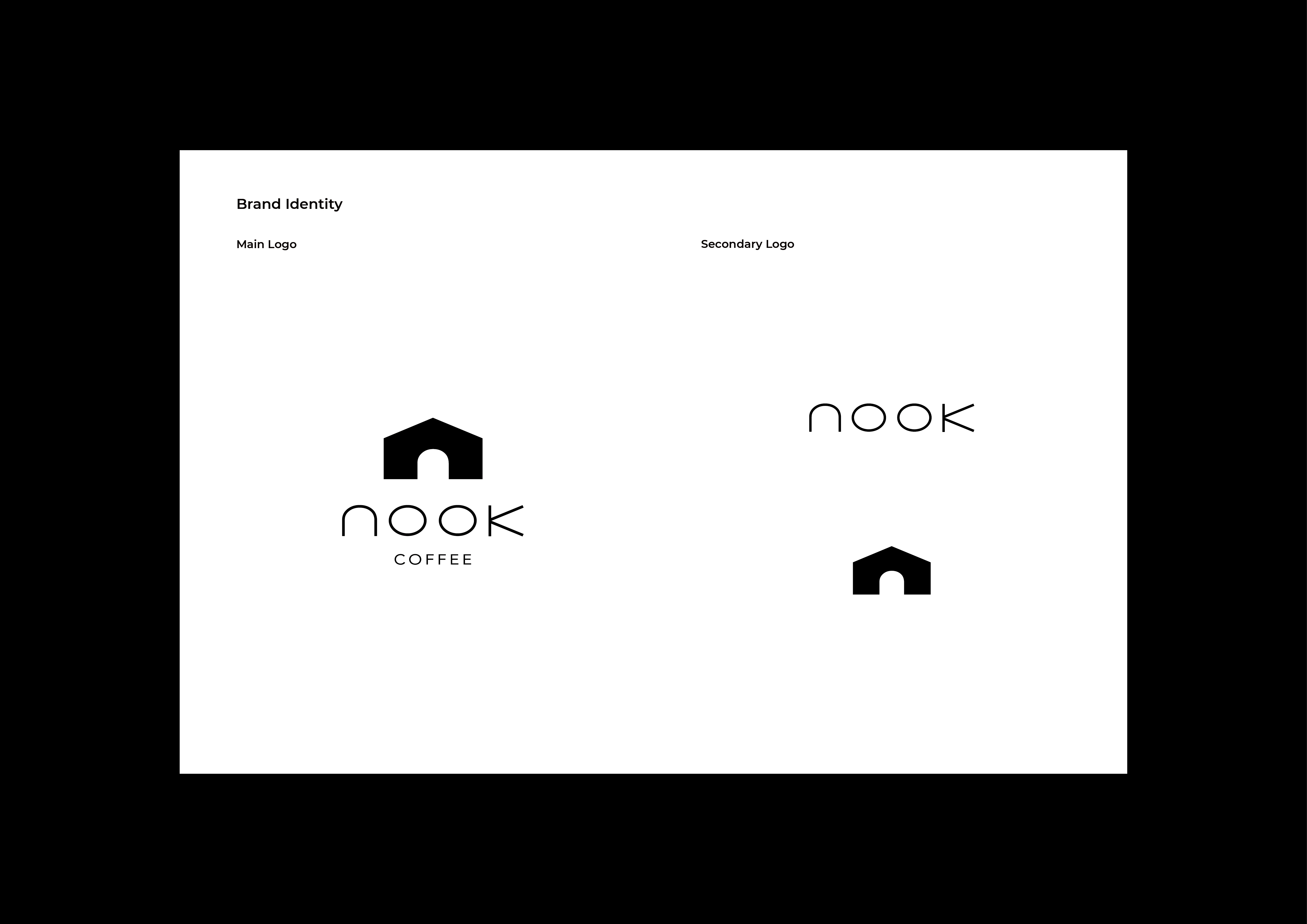
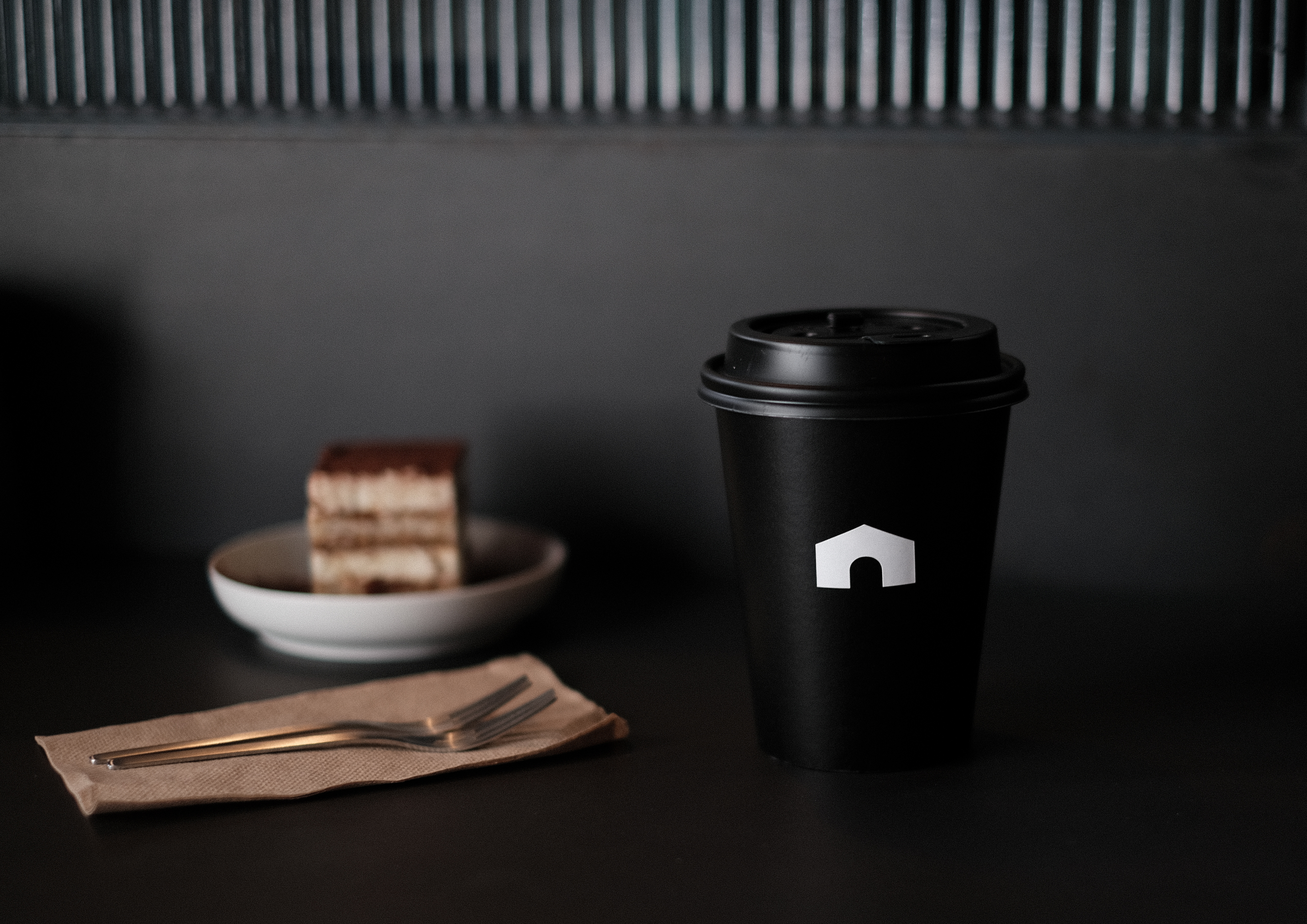
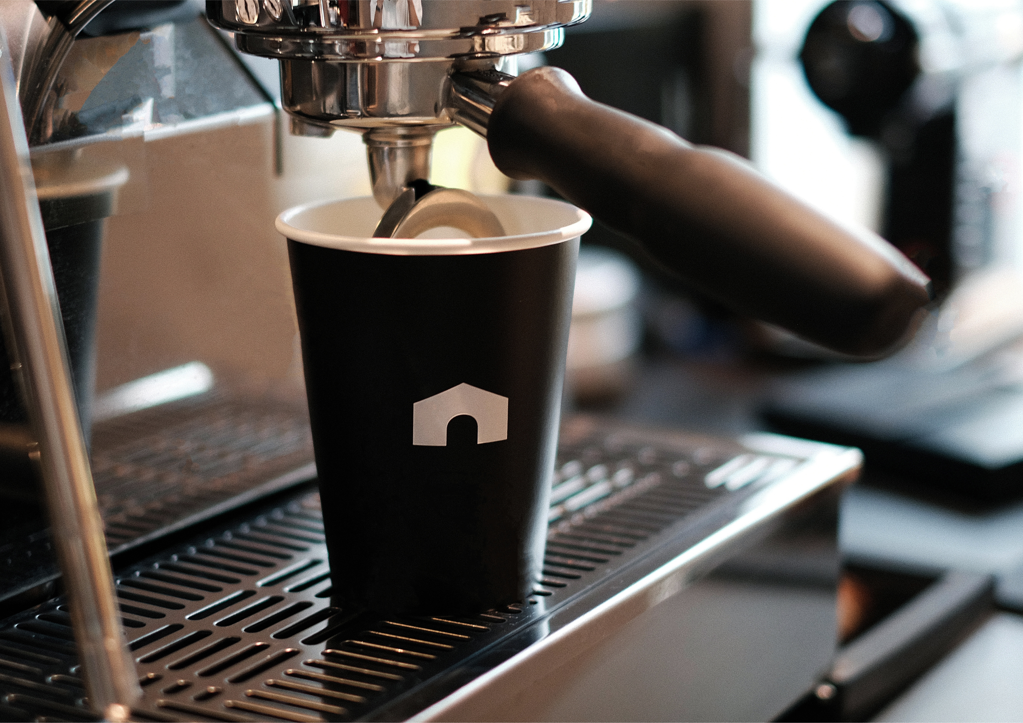
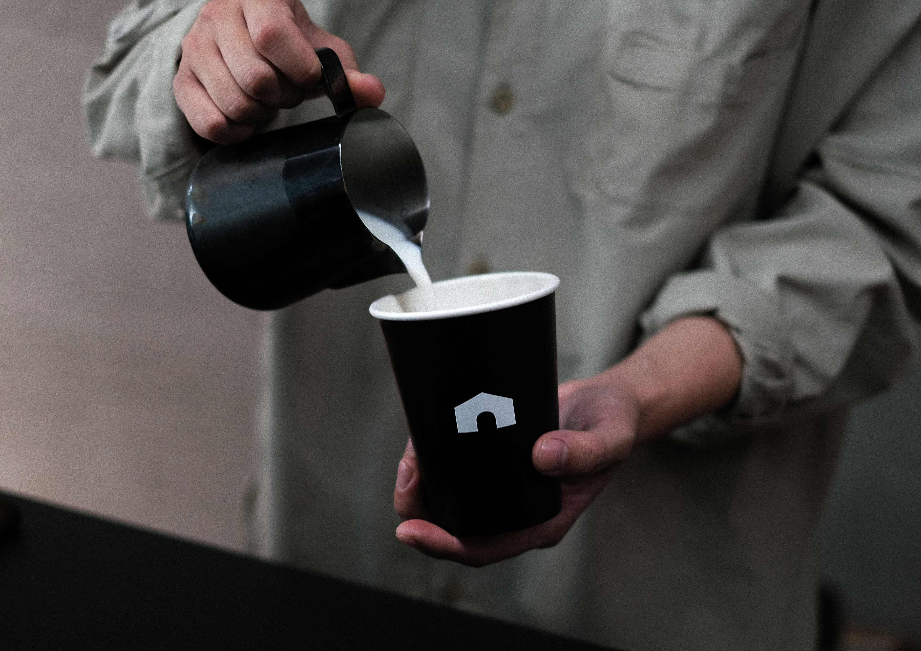
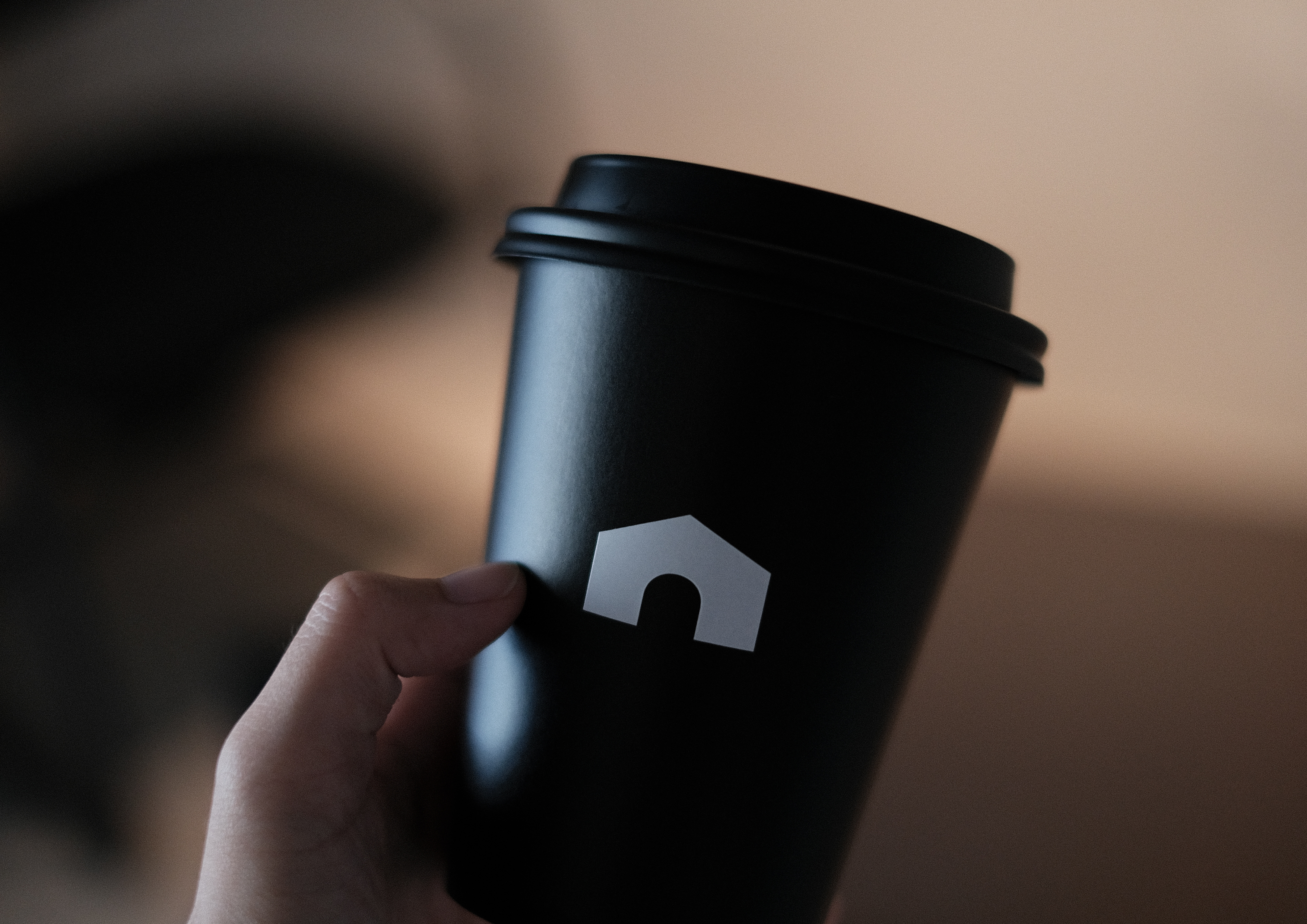
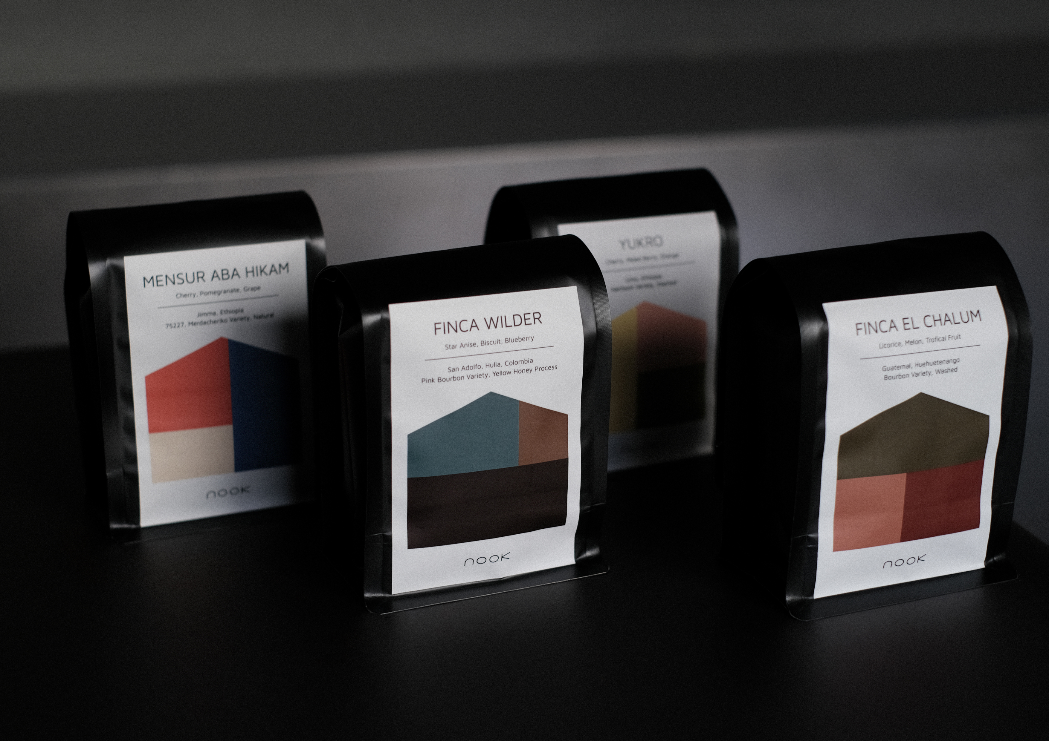
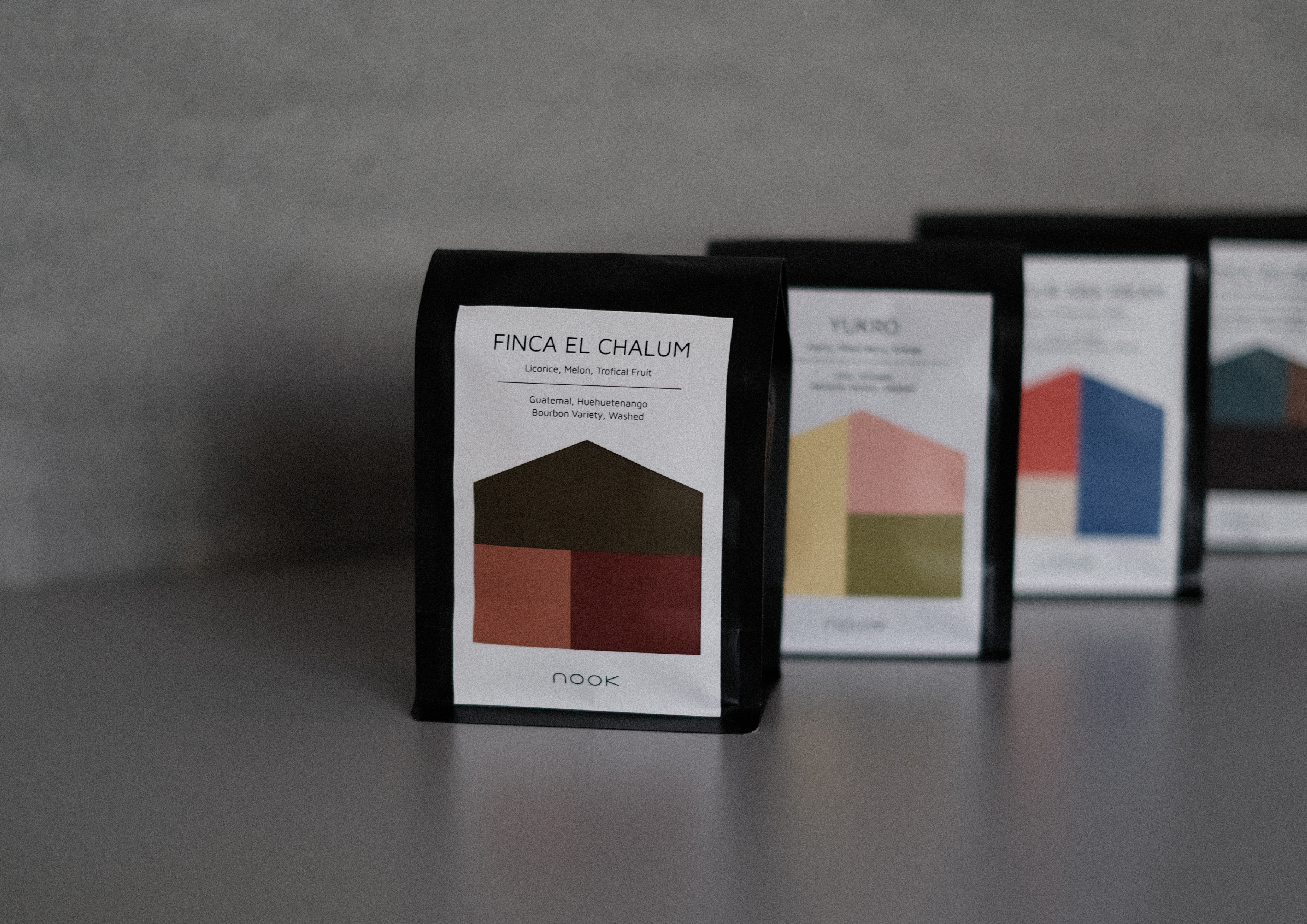
從品牌名暗處與角落擷取空間陰翳之意象,我們為nook設計全新的字體標誌,圓弧形的n是房子造型的門也是一處角落,設計整體呼應空間主要的黑色,在品牌延伸物上用黑灰白來搭配,並以咖啡風味輪的色塊拼貼成豆袋圖案,褪去過多的設計,期望為nook coffee延展更多的可能性。
Nook means "dark place, corner", and continues the barista to create another quiet coffee shop in Kaohsiung. The brand contains the design tone of Melbourne's simple texture, combined with modern black iron and nordic furniture in the interior. After the renovation of the eighty years old house in Yancheng, it reinterprets a different brand experience.
Capture the image from dark place and corner of the brand name, we designed a new typography logo for nook. The arc-shaped n is the door of the house shape and also a corner. The overall design echoes the main black color of the space. It's matched with black, gray and white, and the color blocks of the coffee flavor wheel are collaged into a coffee bean bag pattern, which removes too many designs and hopes to expand more possibilities for nook coffee.
C: NOOK COFFEE
AD&D:YUF STUDIO
ID:屋物工作室
PH:Molly Lin (Packaging)、Yu Fan Ye (Image)
T:Branding、Packaging
Y:2022
AD&D:YUF STUDIO
ID:屋物工作室
PH:Molly Lin (Packaging)、Yu Fan Ye (Image)
T:Branding、Packaging
Y:2022