


JOYWHEN
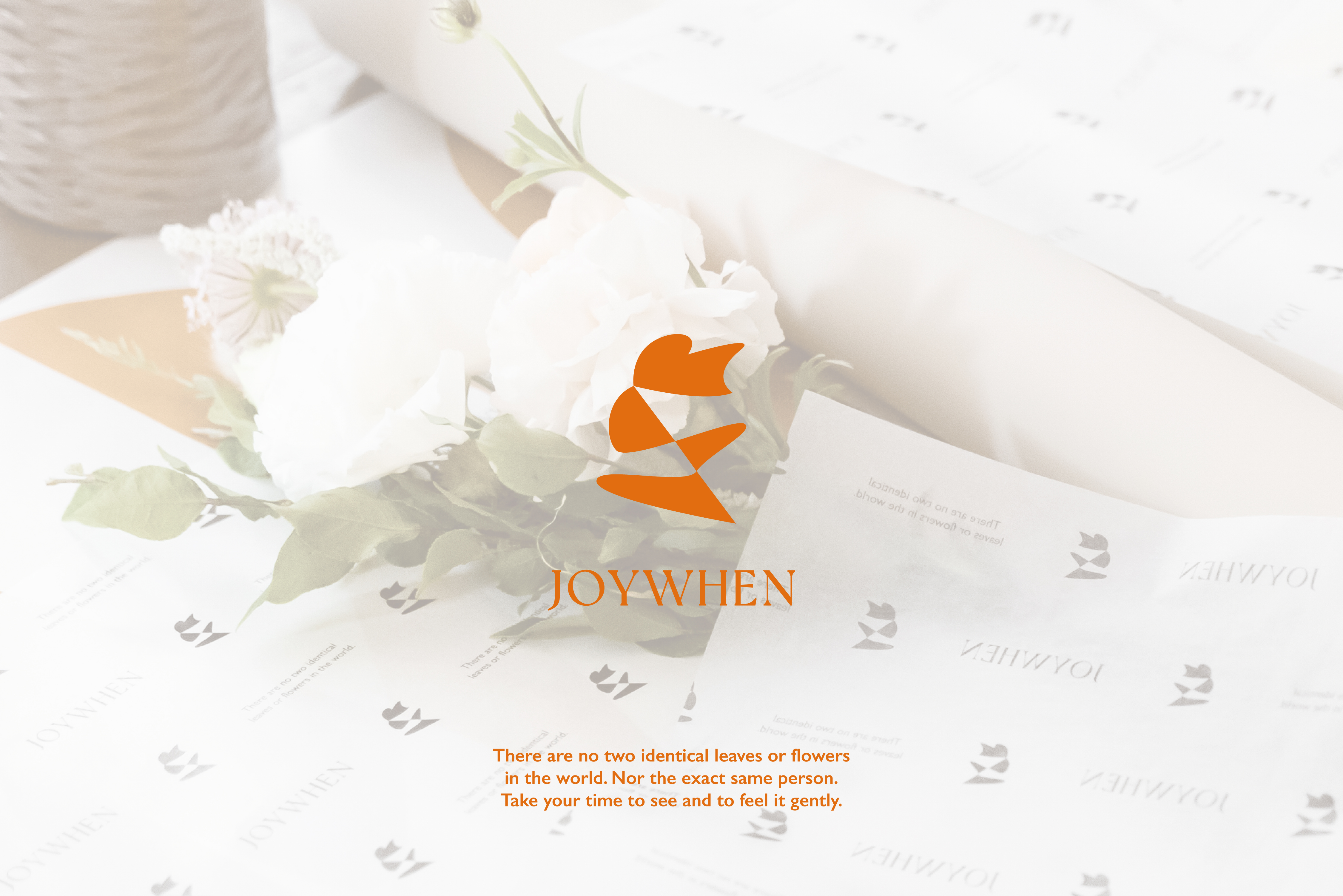
JOYWHEN 來自台北的九灰花藝工作室,將於2022年品牌成立的第五週年換上新的品牌識別,品牌精神想傳遞花朵陪伴無時無刻的喜悅為核心,更期望透過每束花來連結人與人之間生生不息的感染力,即使花朵期限有限,留下的心意仍可以被永恆存放,延長每朵花的意義與紀念。
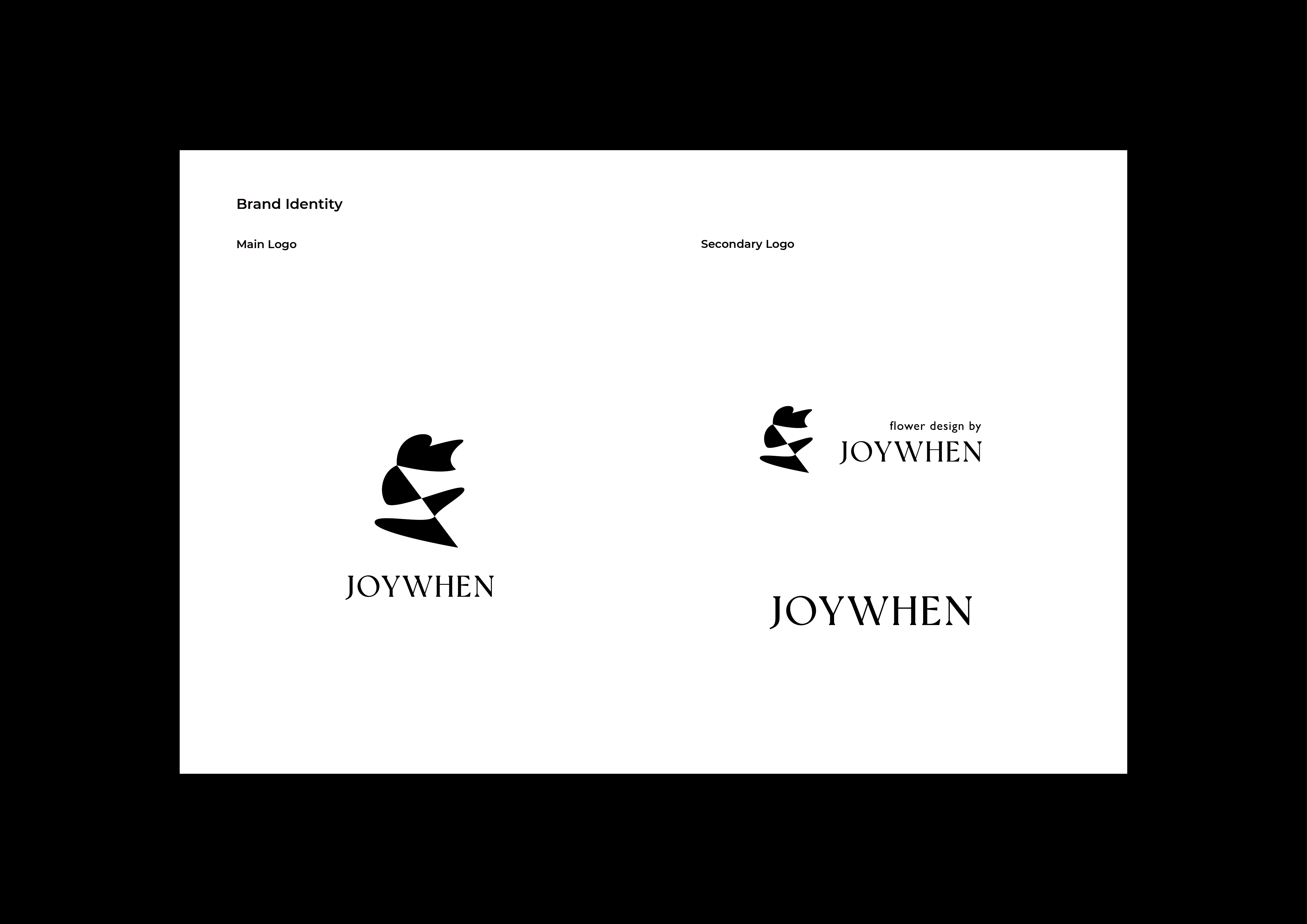
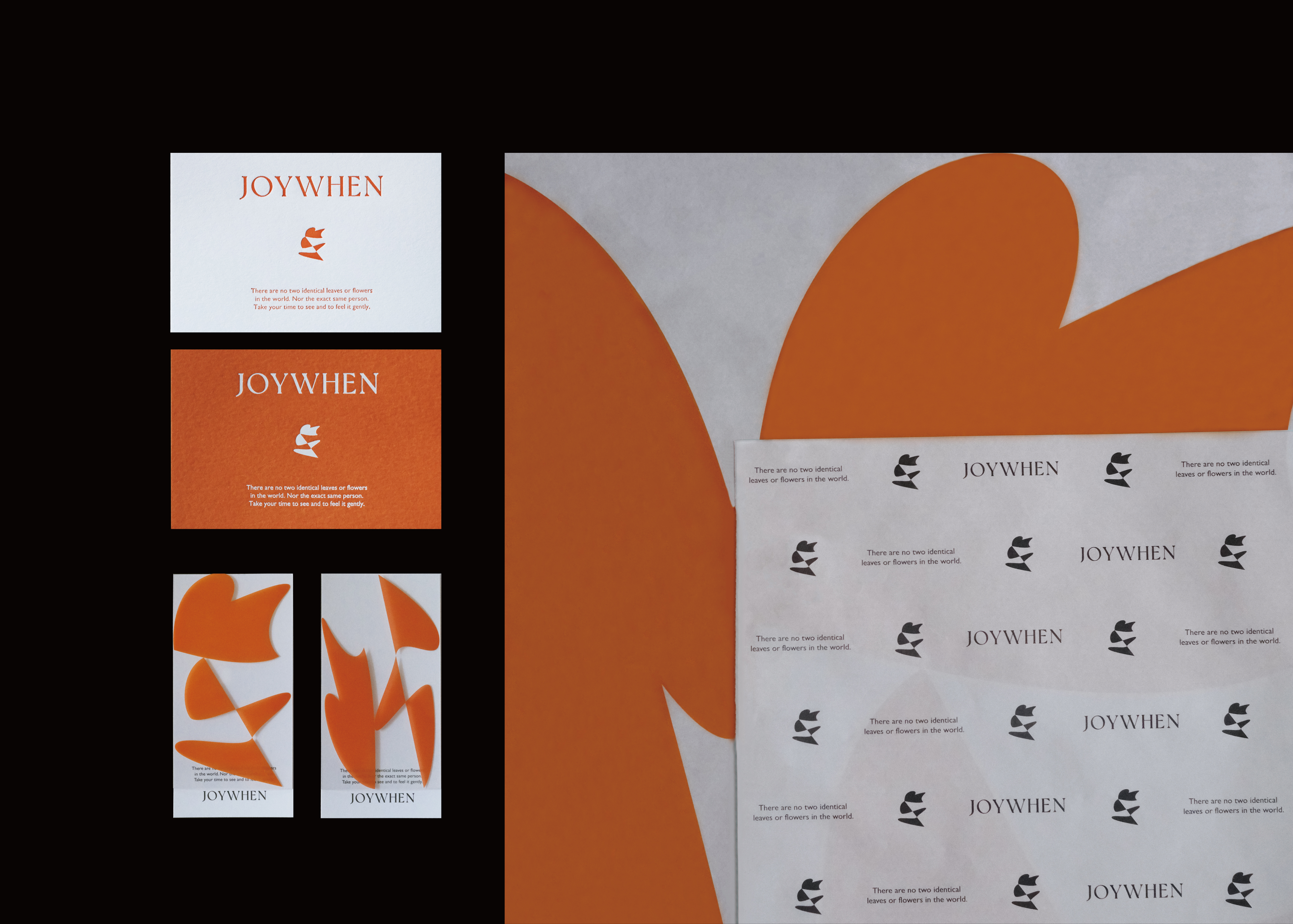
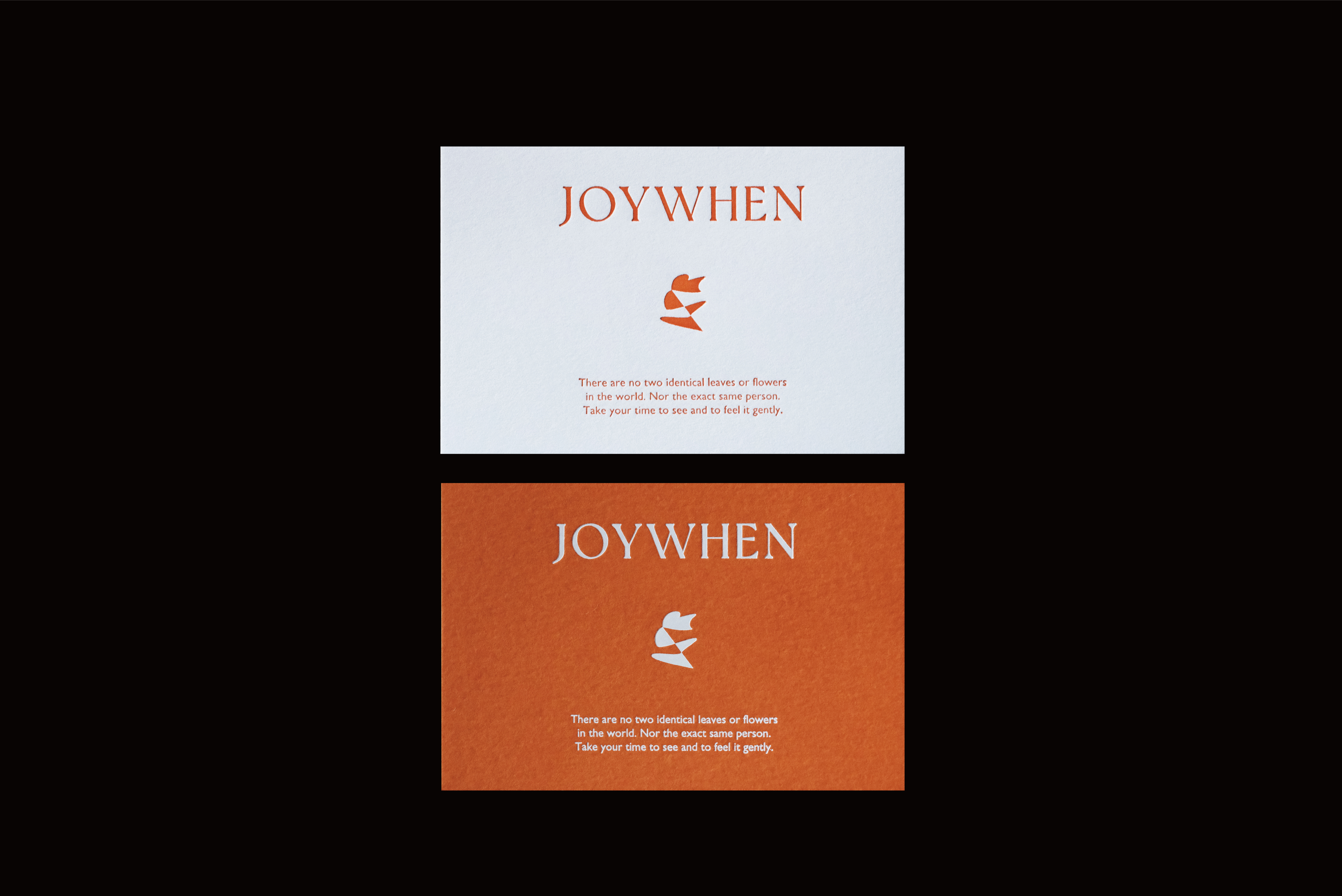
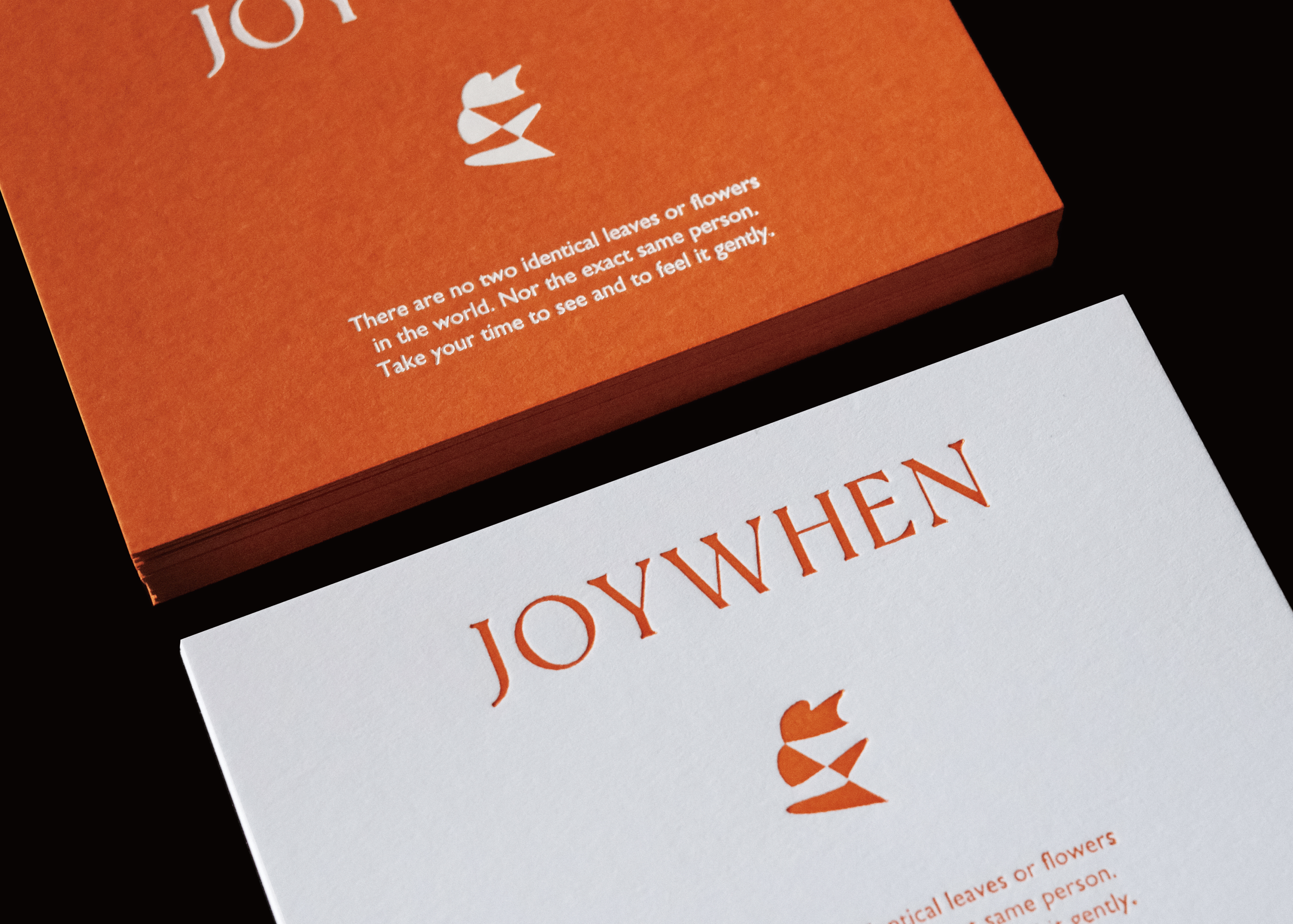
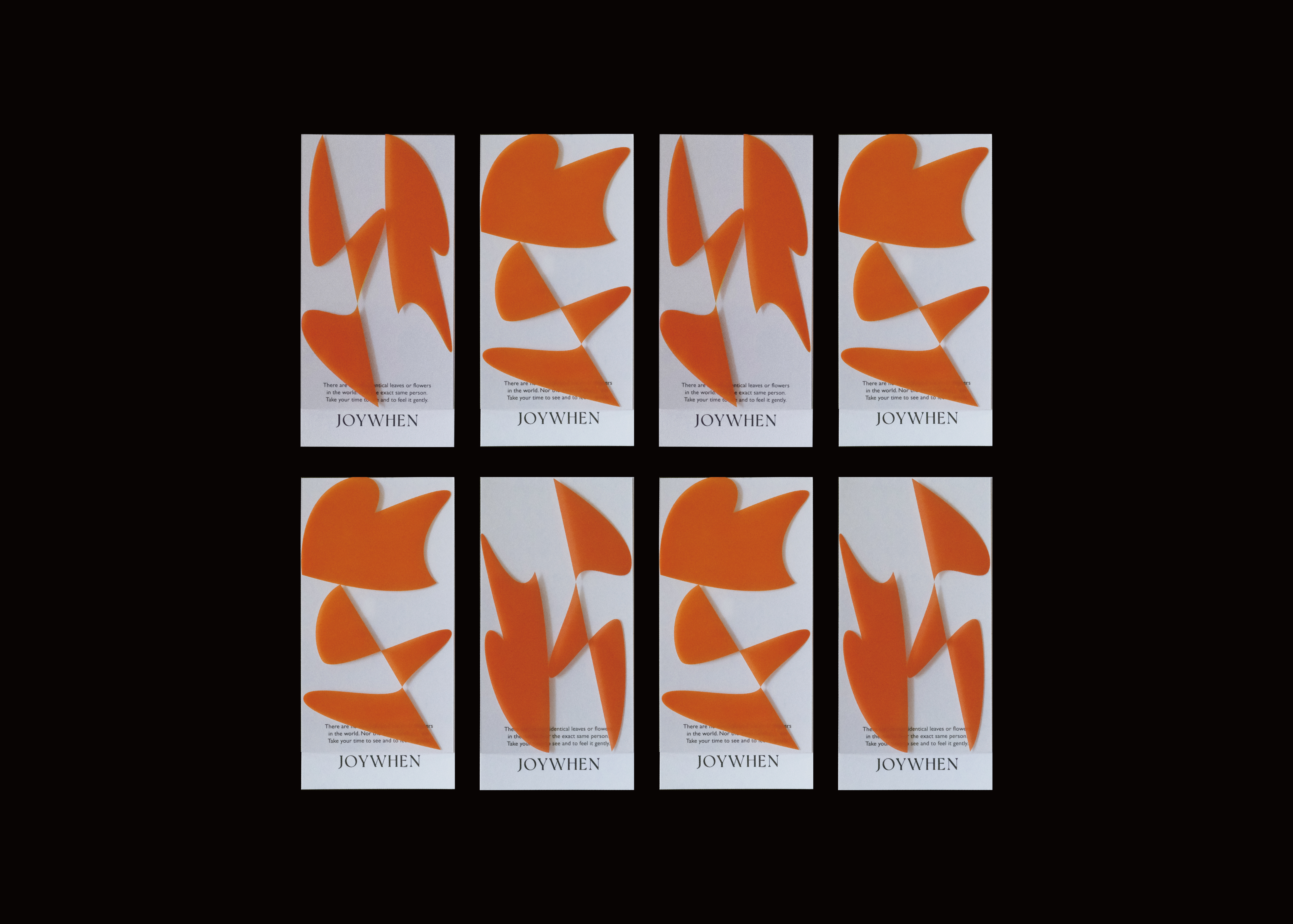
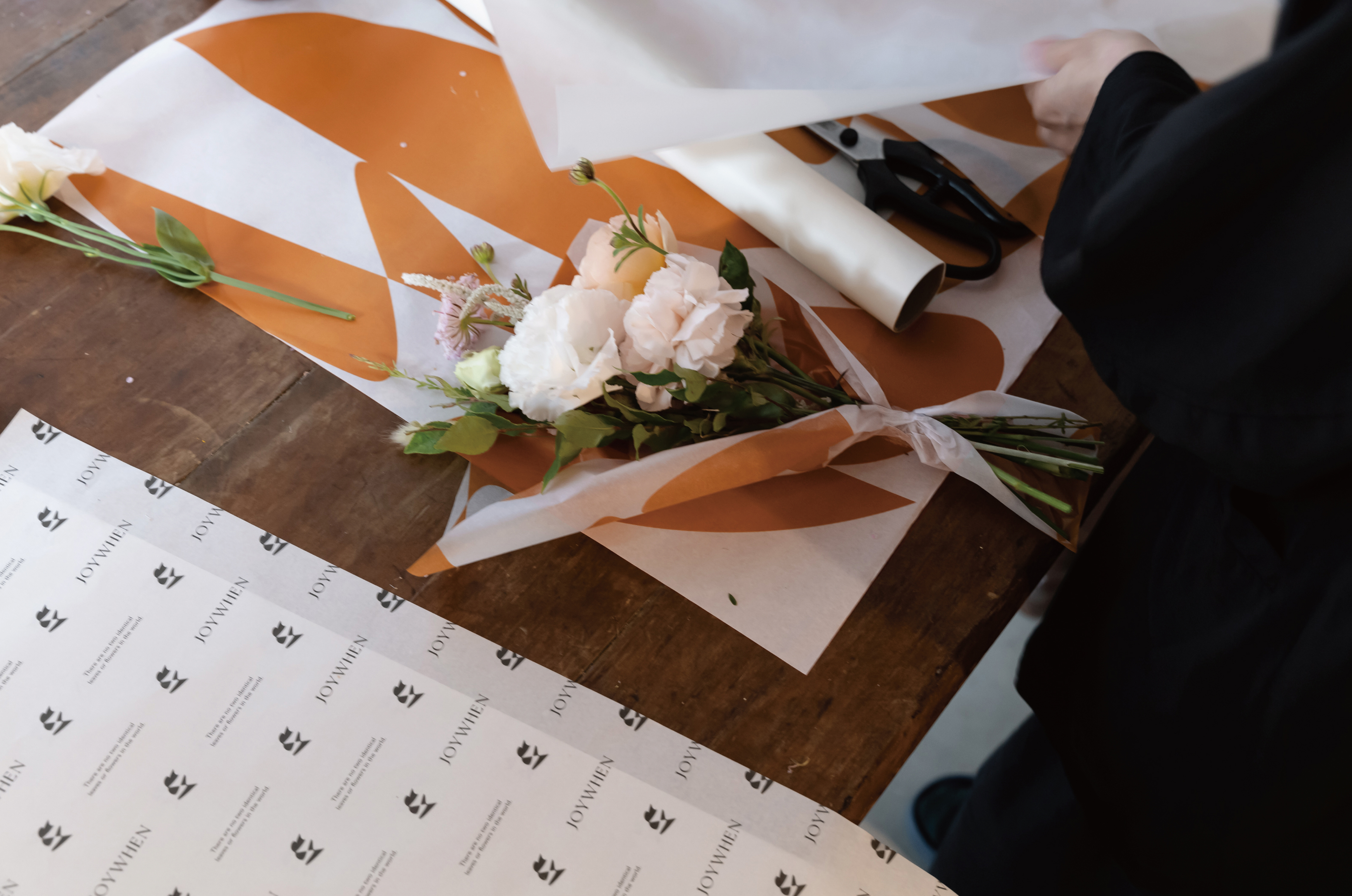
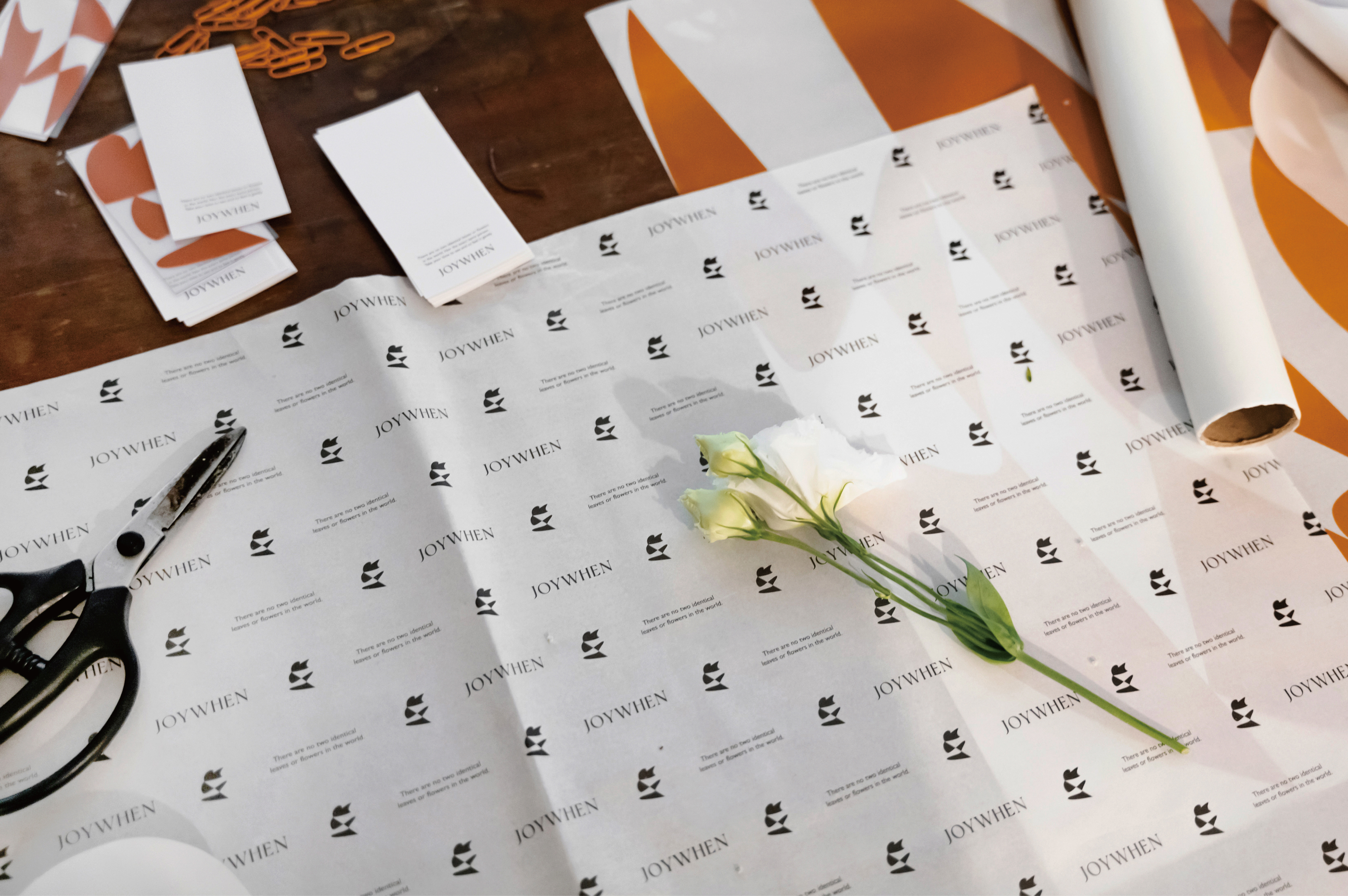
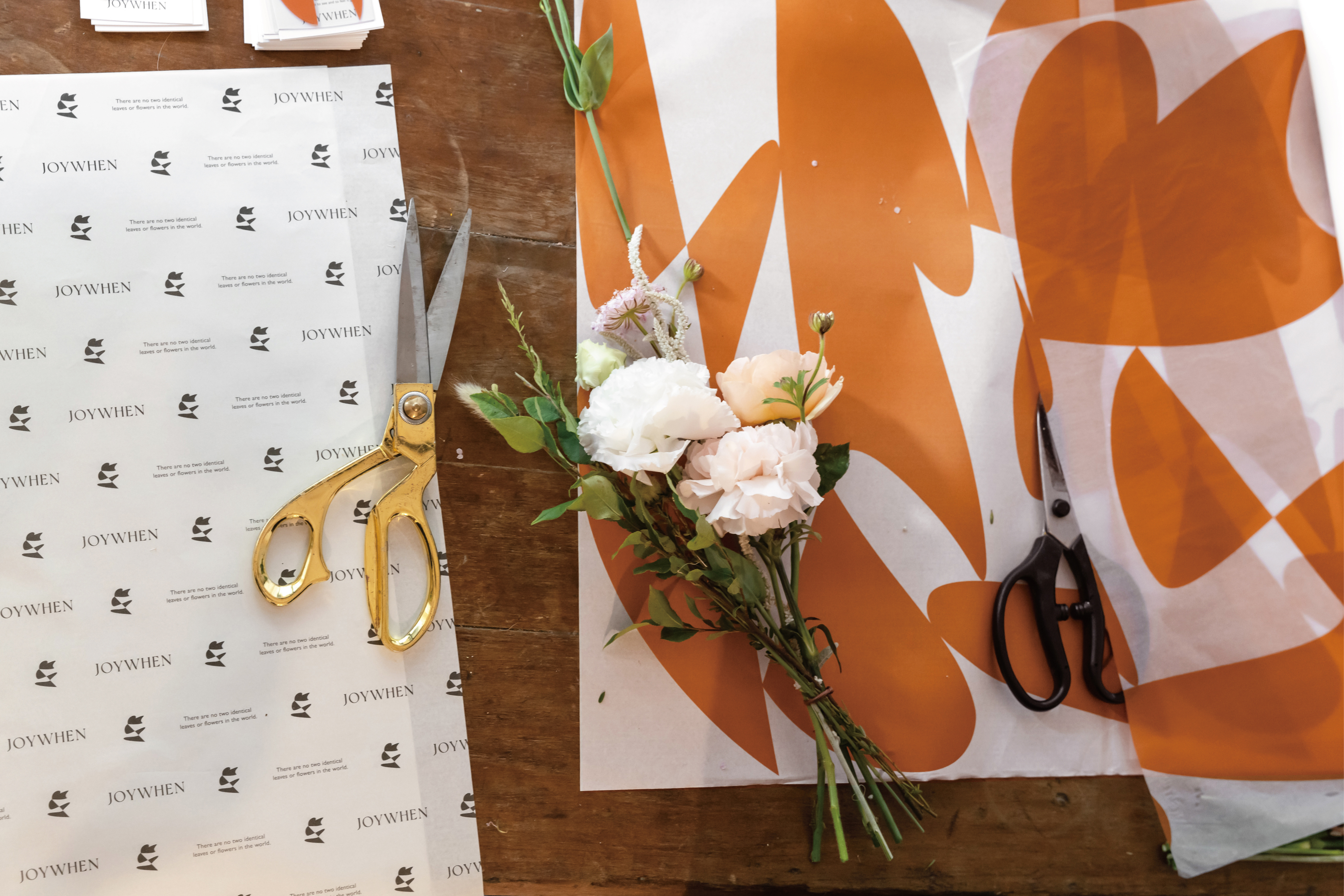
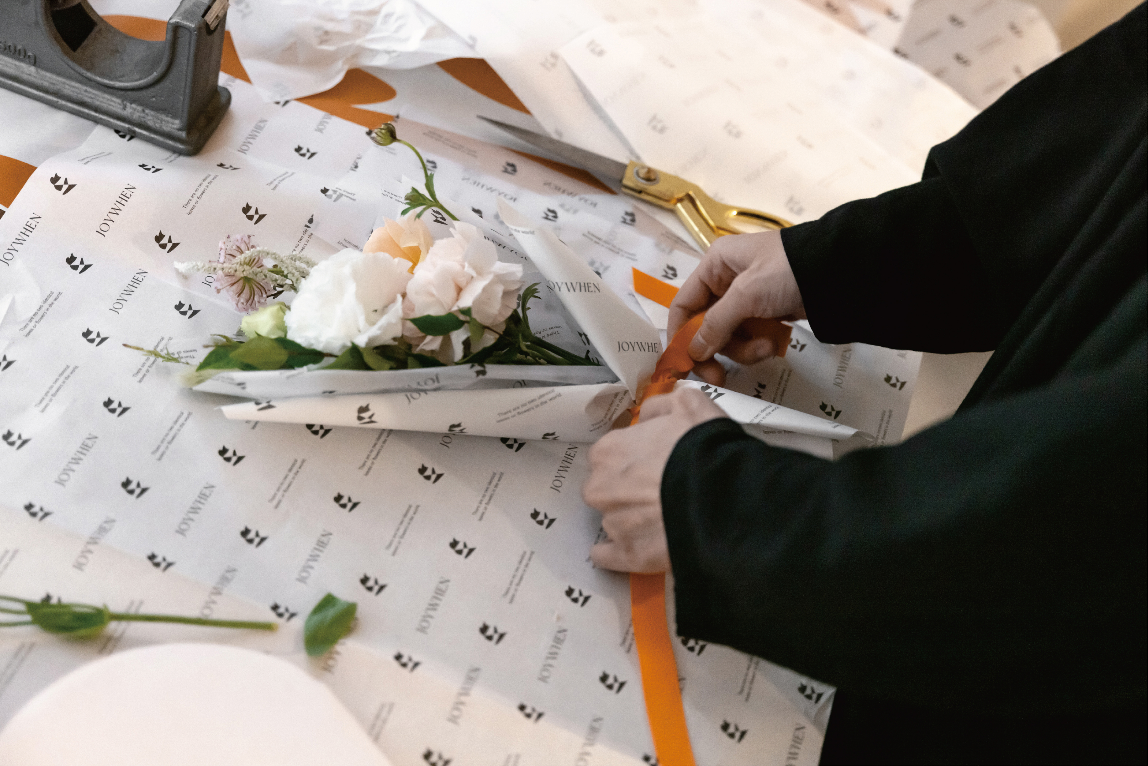
品牌LOGO是一朵花的喜悅的舞姿,設計手法轉化為抽象簡單的造型,也像是花因爲陽光伴隨的「剪影」元素,進而延伸出更多變的品牌圖案。整體視覺透過淨白透明的顏色加上顯眼的橘色色塊帶出溫暖與生機的氛圍。印刷物延續這樣的設計概念,紙張選擇了17g與35g的薄紙以及全透明片,讓圖案不僅可以與光影產生變化,也透過不同材質的堆疊營造像是花瓣散落般的效果,同時花卡也是書籤的概念,保存下來使用的同時,也像是延長了花朵的生命力。
JOYWHEN is a floral studio from Taipei, they will put on a new brand identity for the fifth anniversary in 2022. The brand spirit wants to convey the joy of flowers accompanying all the time as the core, and hopes to connect people through each bouquet of flowers. The endless infectious power between them, even if the flower has a limited lifespan, the mind can be stored for eternity.
Brand logo is a joyful dance of a flower. The design method is transformed into an abstract and simple shape. It is also like the "silhouette" element accompanied by sunlight, which extends to more varied brand patterns. The overall vision brings out a warm and vibrant atmosphere through the pure white transparent color and the conspicuous orange color block. At the same time, the flower transparent card is also the concept of bookmark. When it is saved and used, it also seems to prolong the vitality of the flower.
C: JOYWHEN
AD&D:YUF STUDIO
PH:Yan Chen (Image) 、 Yu Fan Ye (Identity)
T:Branding、Packaging
Y:2022
AD&D:YUF STUDIO
PH:Yan Chen (Image) 、 Yu Fan Ye (Identity)
T:Branding、Packaging
Y:2022