


HIPSTER BRIGHTON
Story
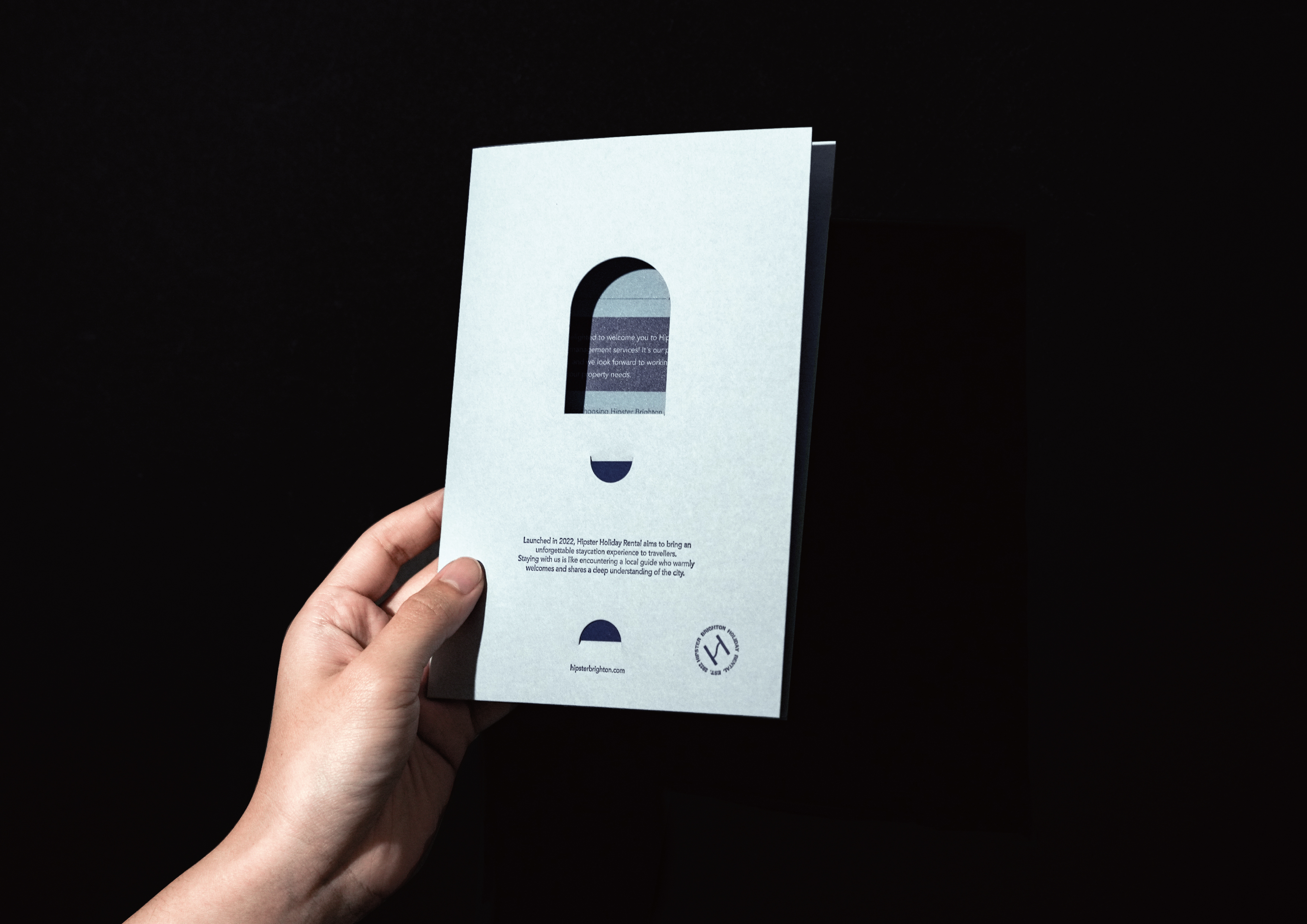
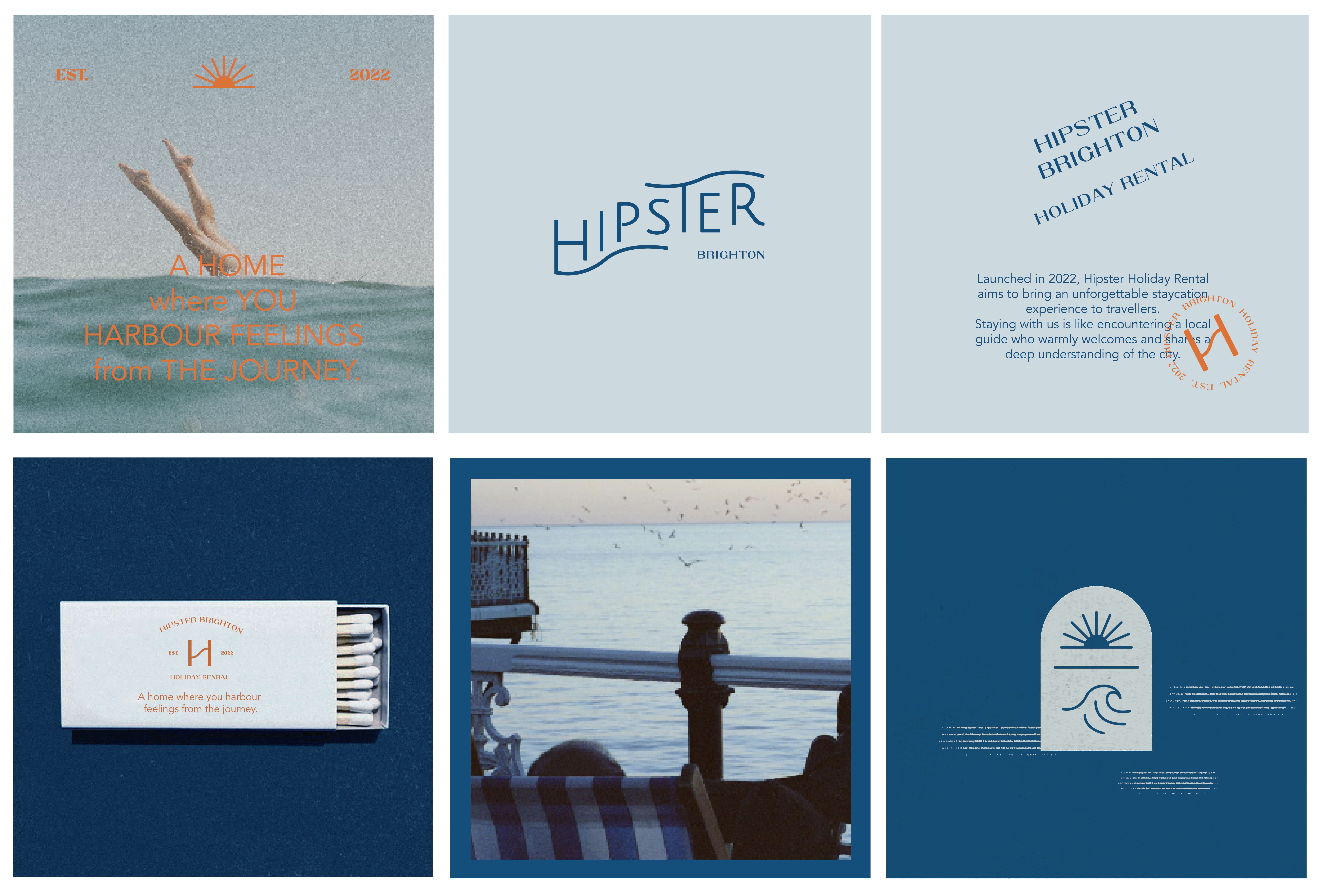
Founded in 2022 by Wing, a travel enthusiast, Hipster Holiday Rental began its journey in the seaside city of Brighton, UK. With sea views right outside the windows and locations close to the coast, the stays offer a homely, comfortable experience for travelers visiting different unique cities. More than just a place to rest, stepping into a Hipster Holiday Rental feels like meeting a warm, welcoming local guide—someone eager to share in-depth knowledge of the city and create unforgettable memories for every journey.
由著迷於旅行的主理人 Wing 於 2022 年創立,Hipster Holiday Rental 發跡於英國濱海城市 Brighton,房間窗外有海景、地點距離海岸近的旅宿,將如同回家一般的舒適居住體驗,帶給造訪各特色城市的人們。不僅是歇腳處,走進 Hipster Holiday Rental 的空間,就如同遇見一位溫暖歡迎旅人的在地嚮導,分享對城市的深度認識,為停留的每一段旅程帶來難忘回憶。
Slogan
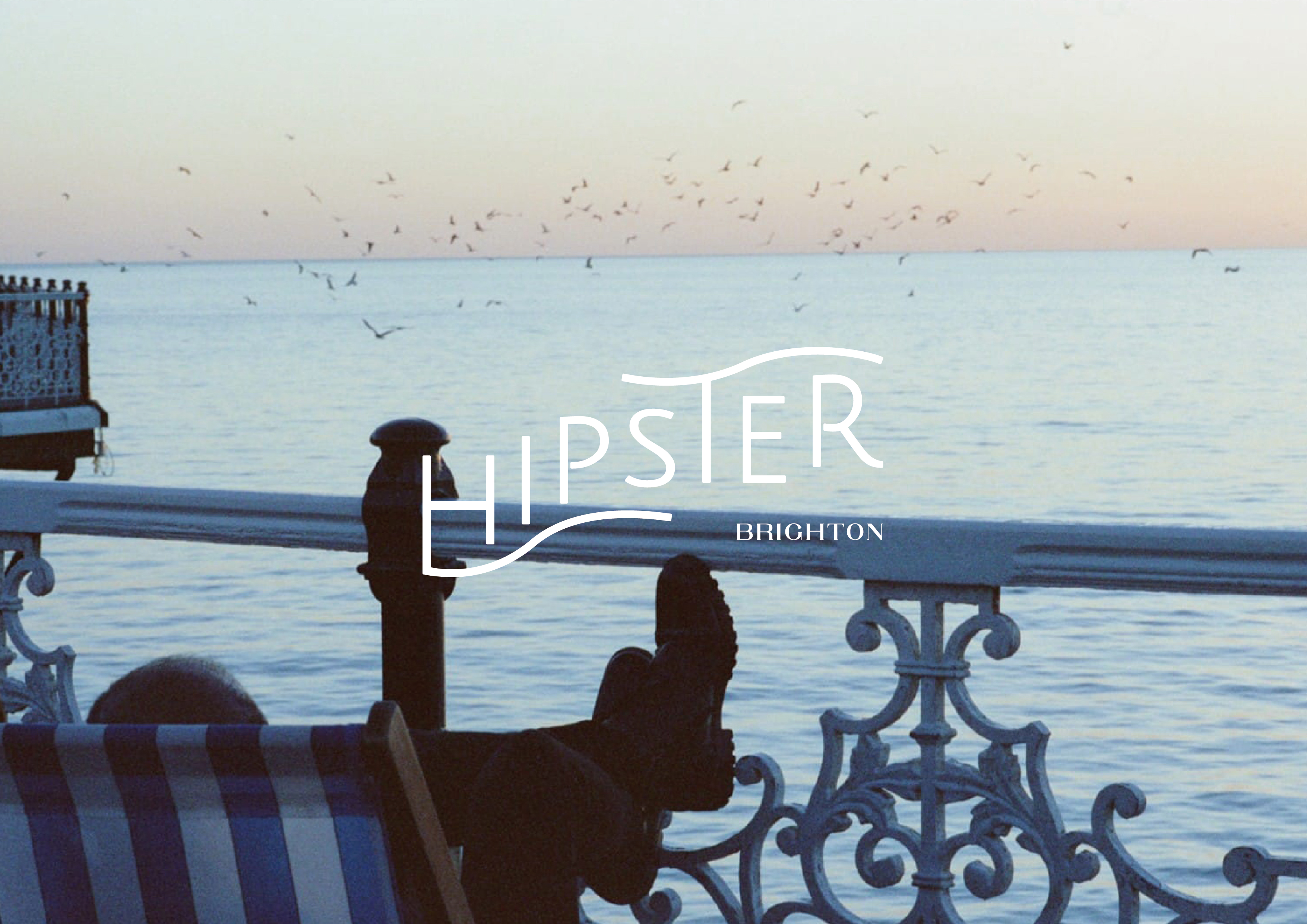
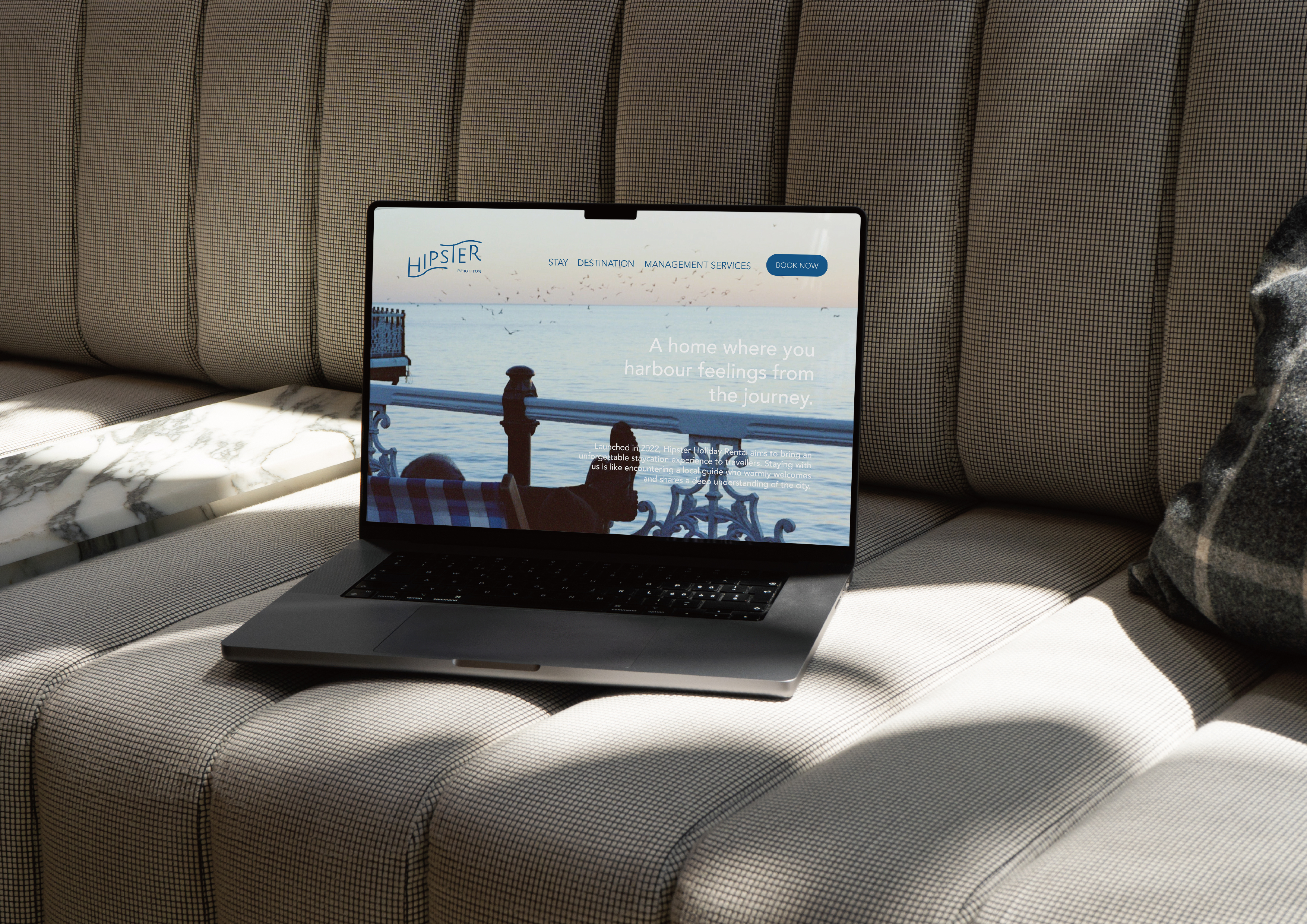
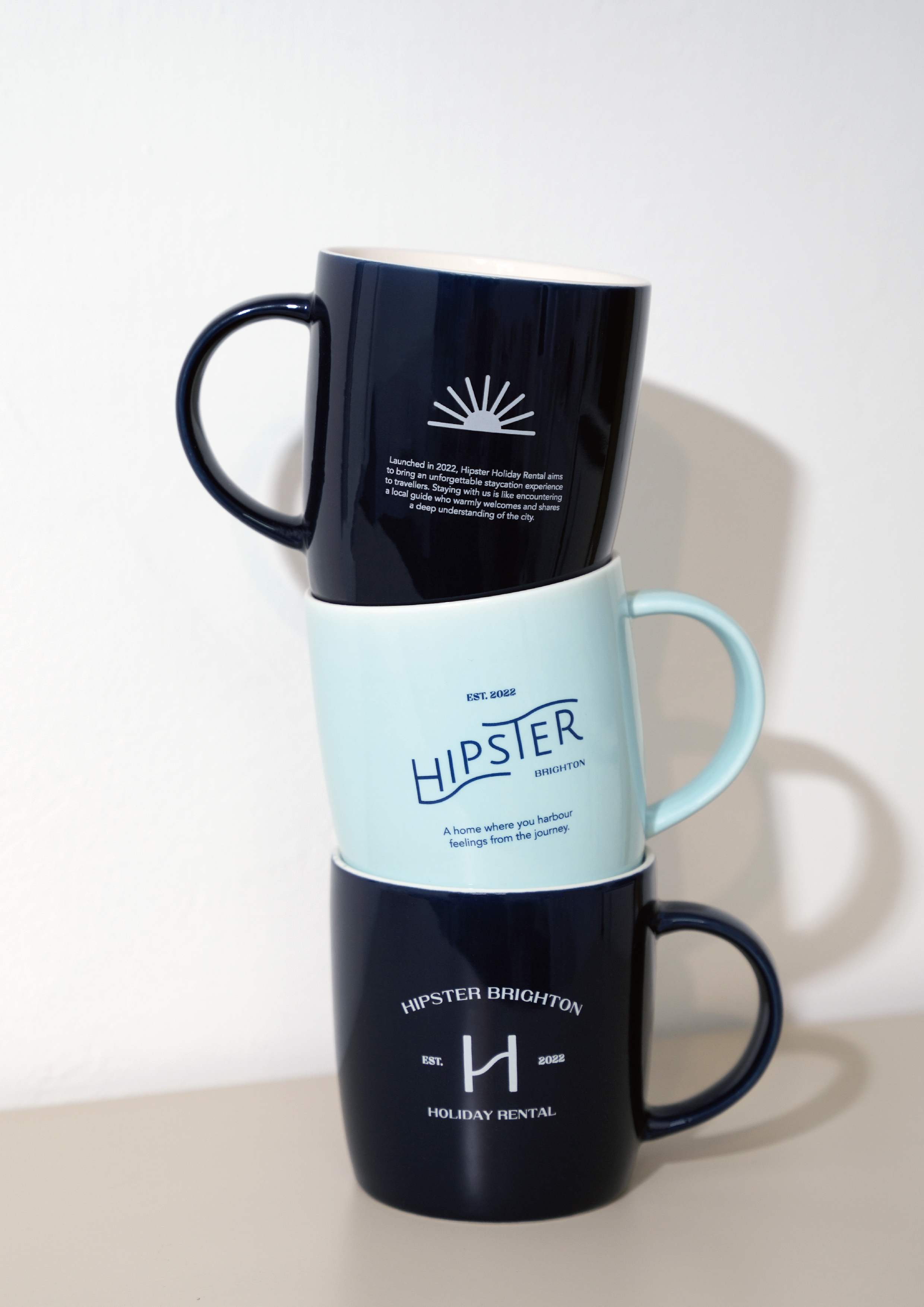
A home where you harbour feelings from the journey.
Visual Identity
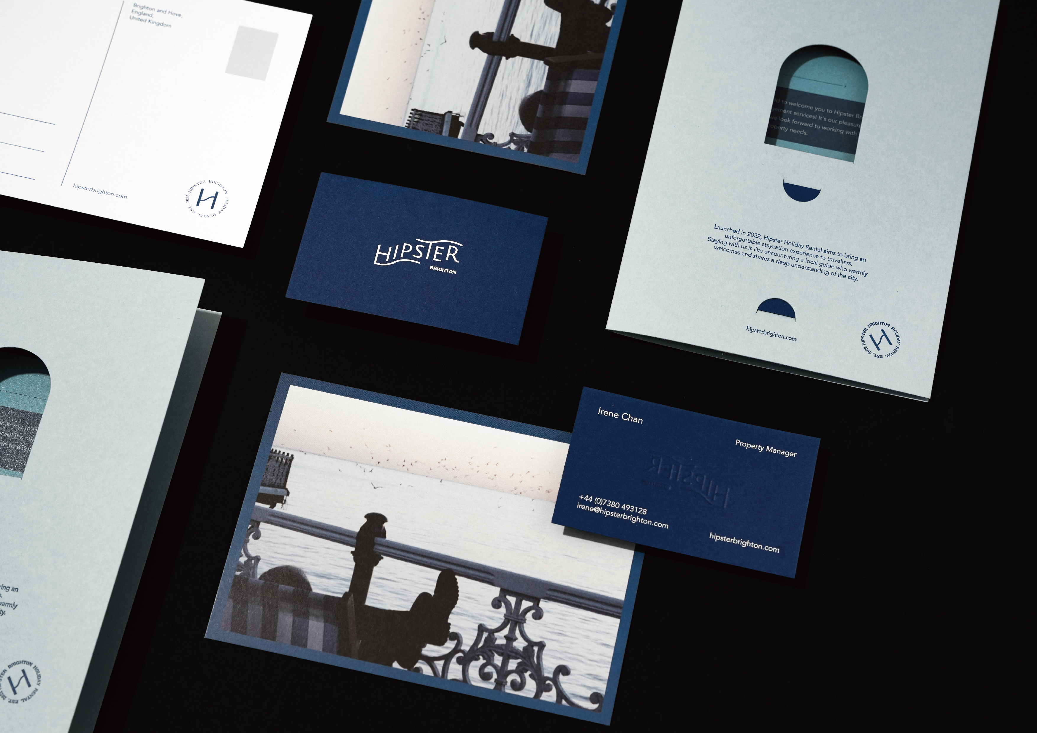
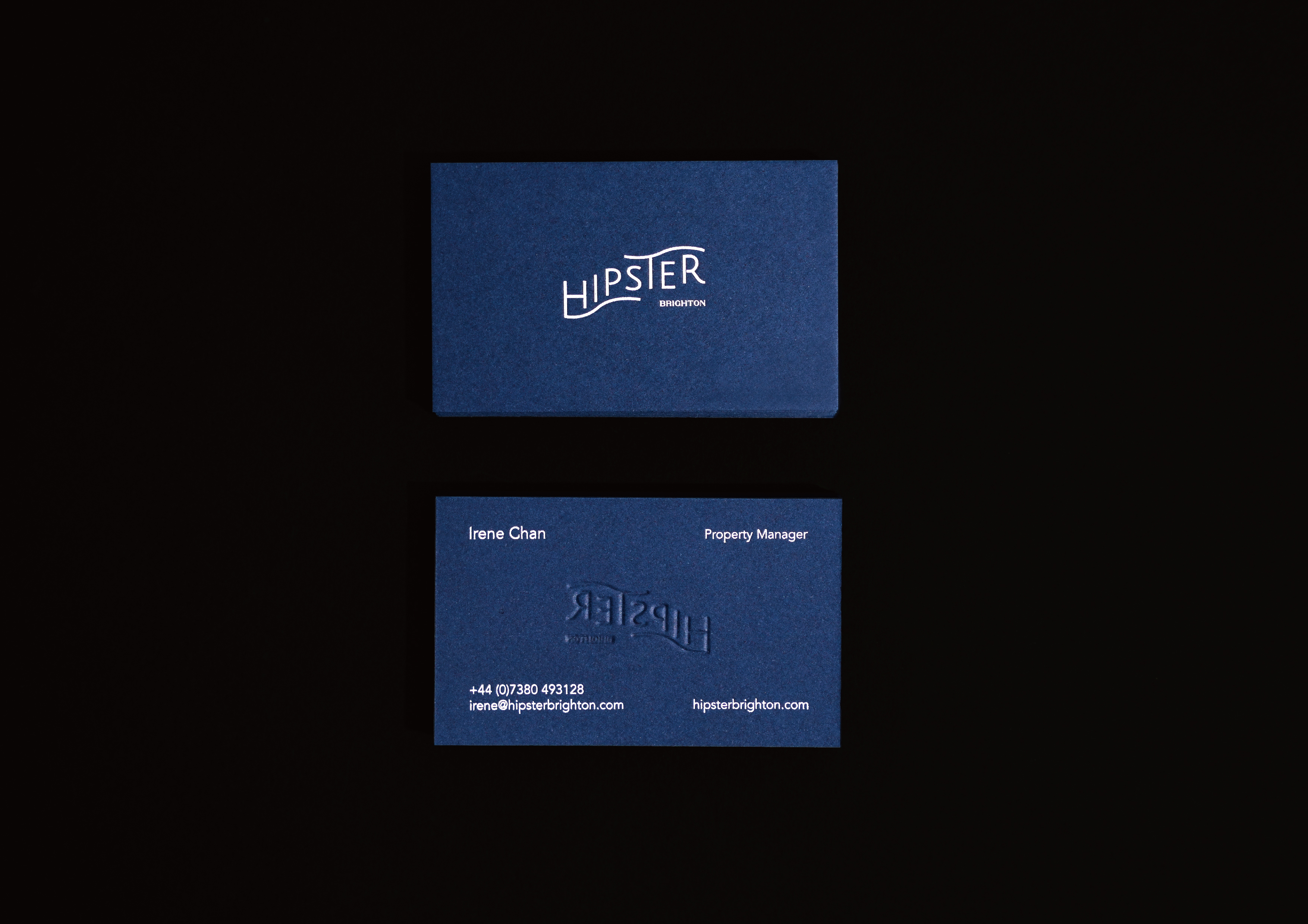
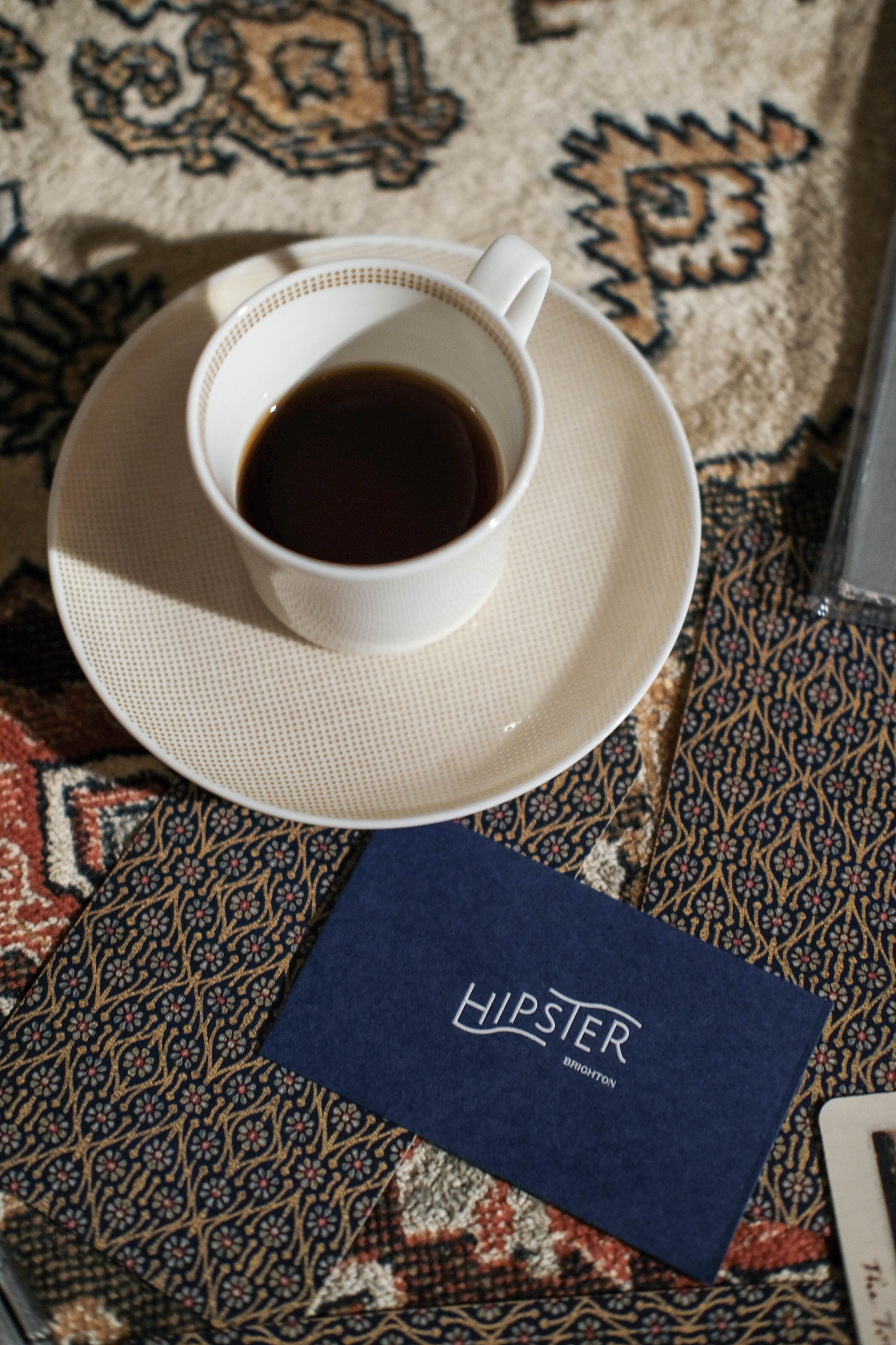
The logotype combines clean, minimalist sans-serif typography with contrasting thick-and-thin serif details, reflecting Hipster Brighton’s contemporary yet timelessly warm character. The playful arrangement of letter heights evokes a sense of lightness and joy, as if the typography itself were dancing in the gentle sunshine and soothing sound of ocean waves.
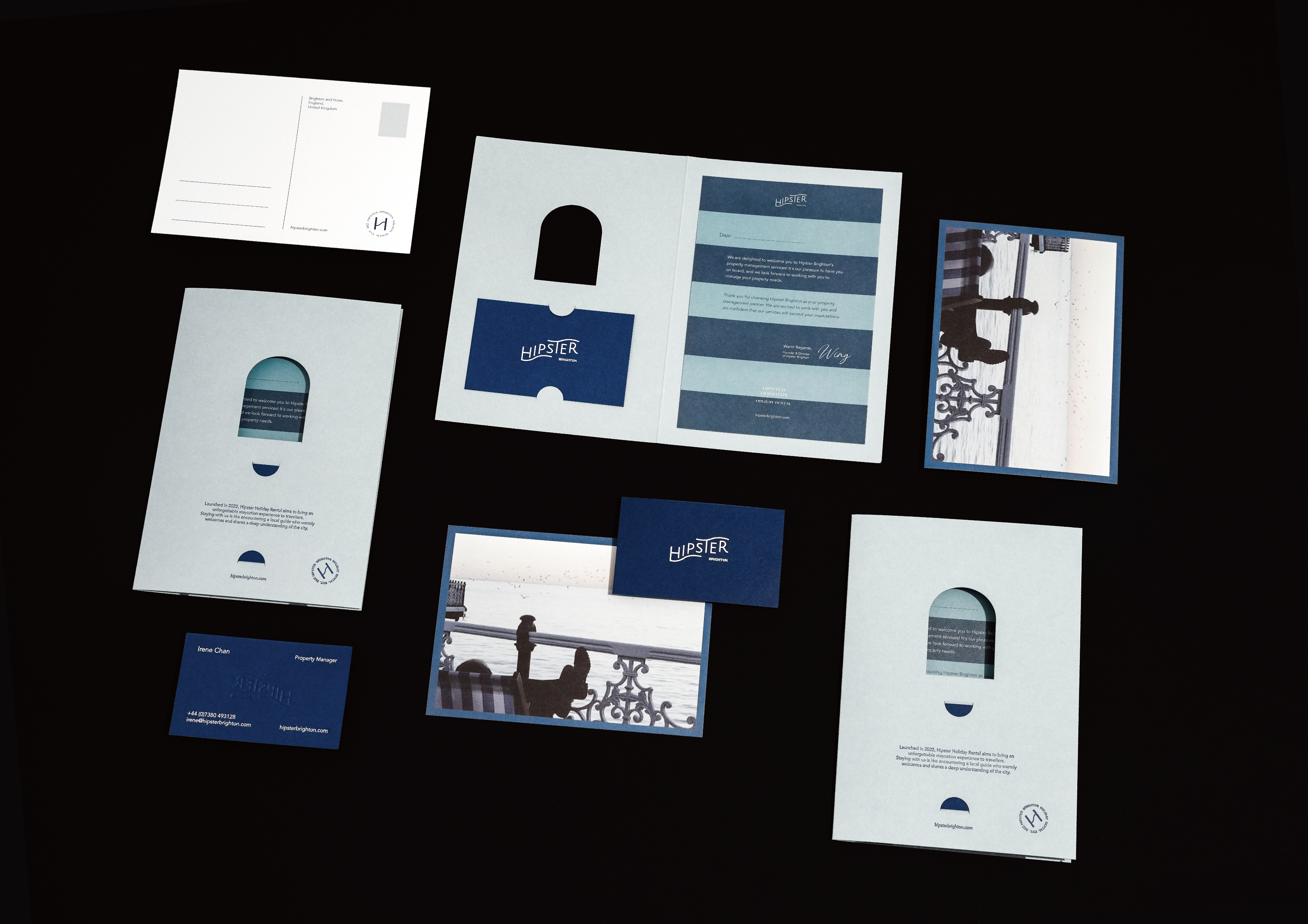
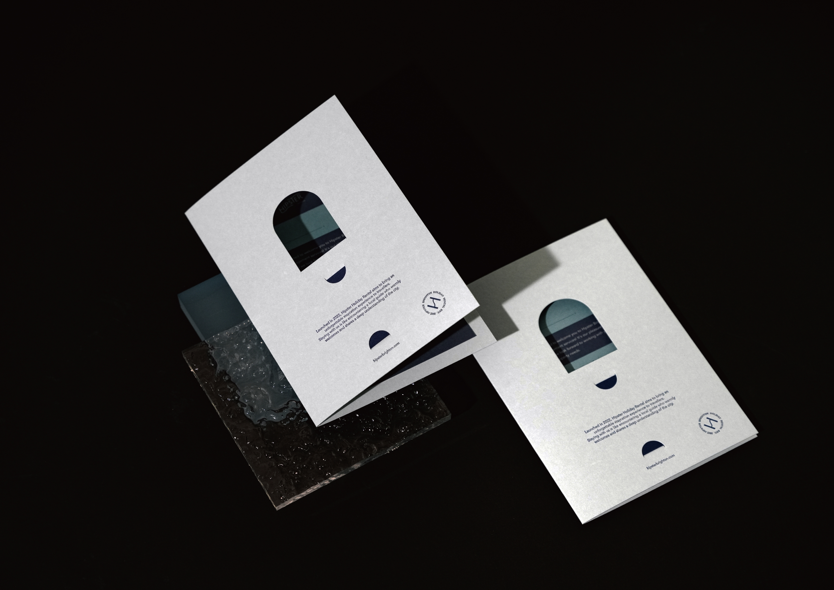
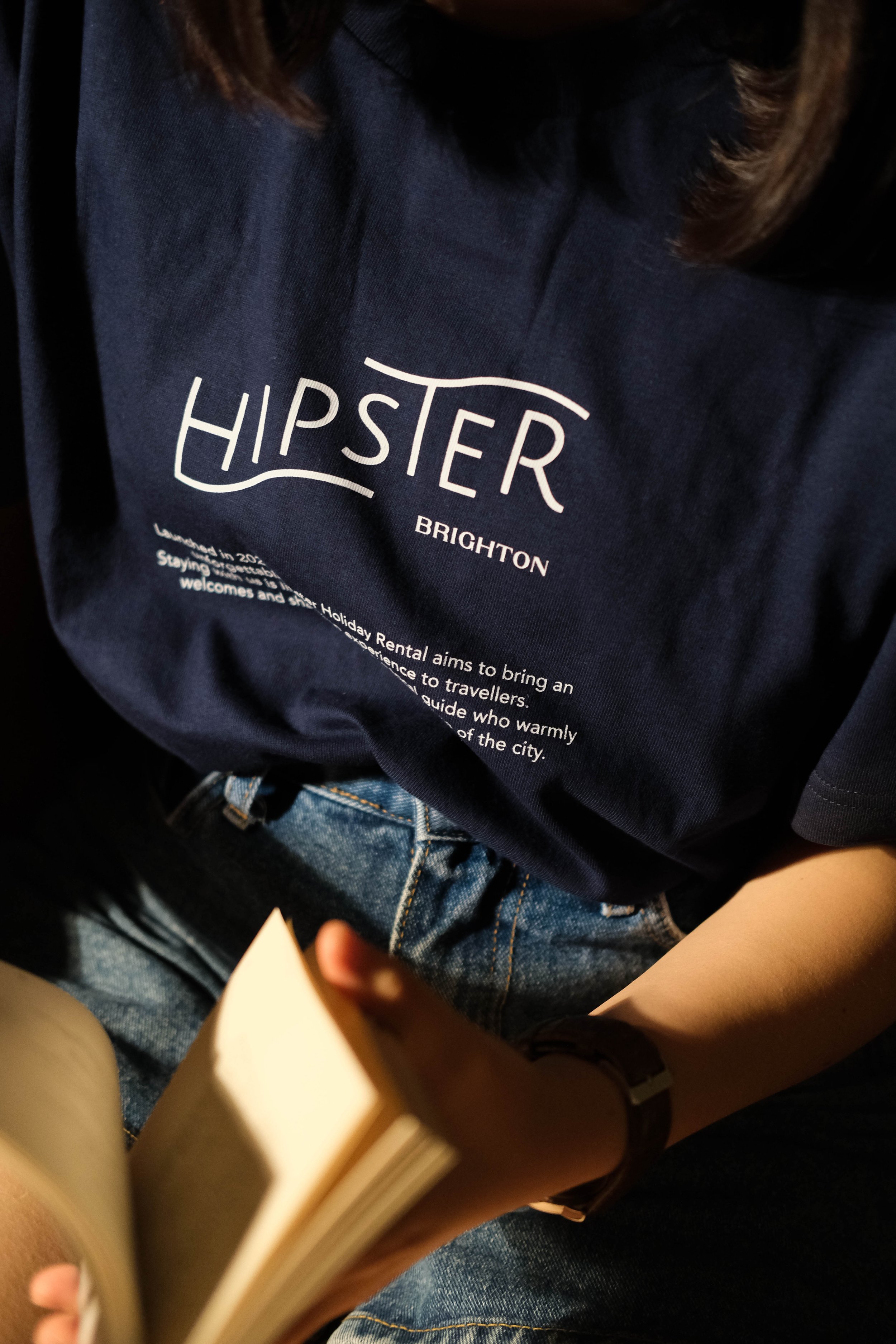
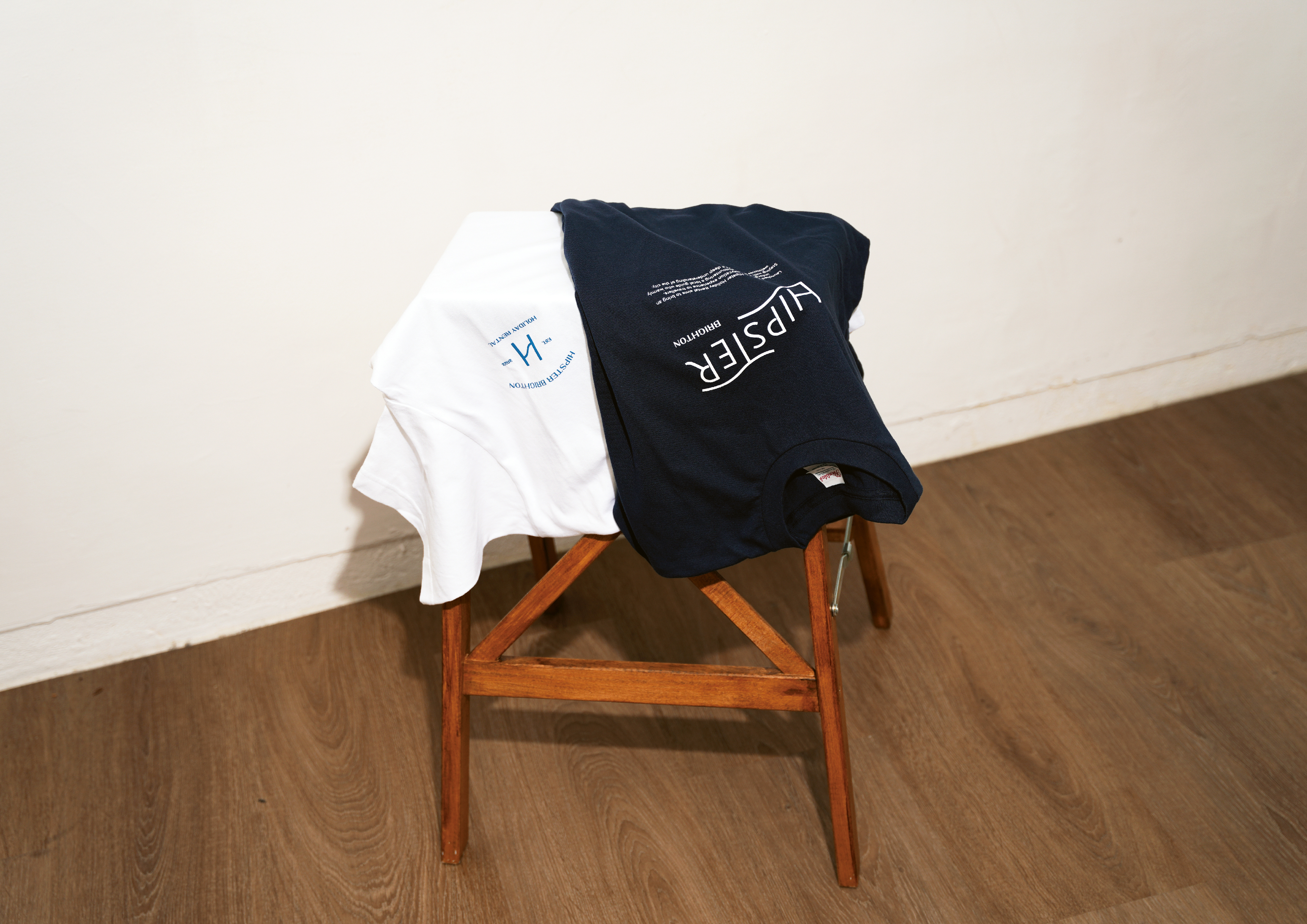
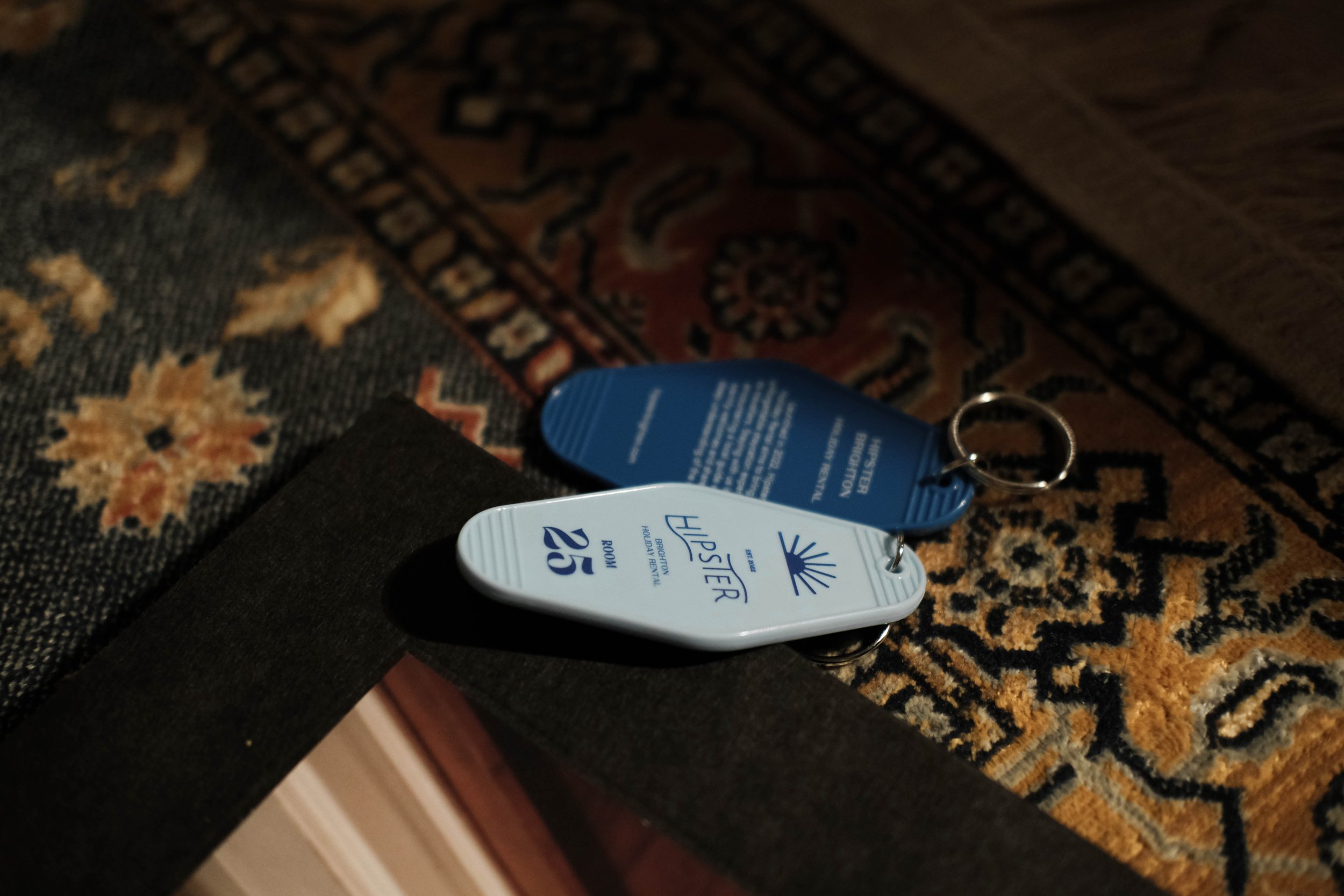
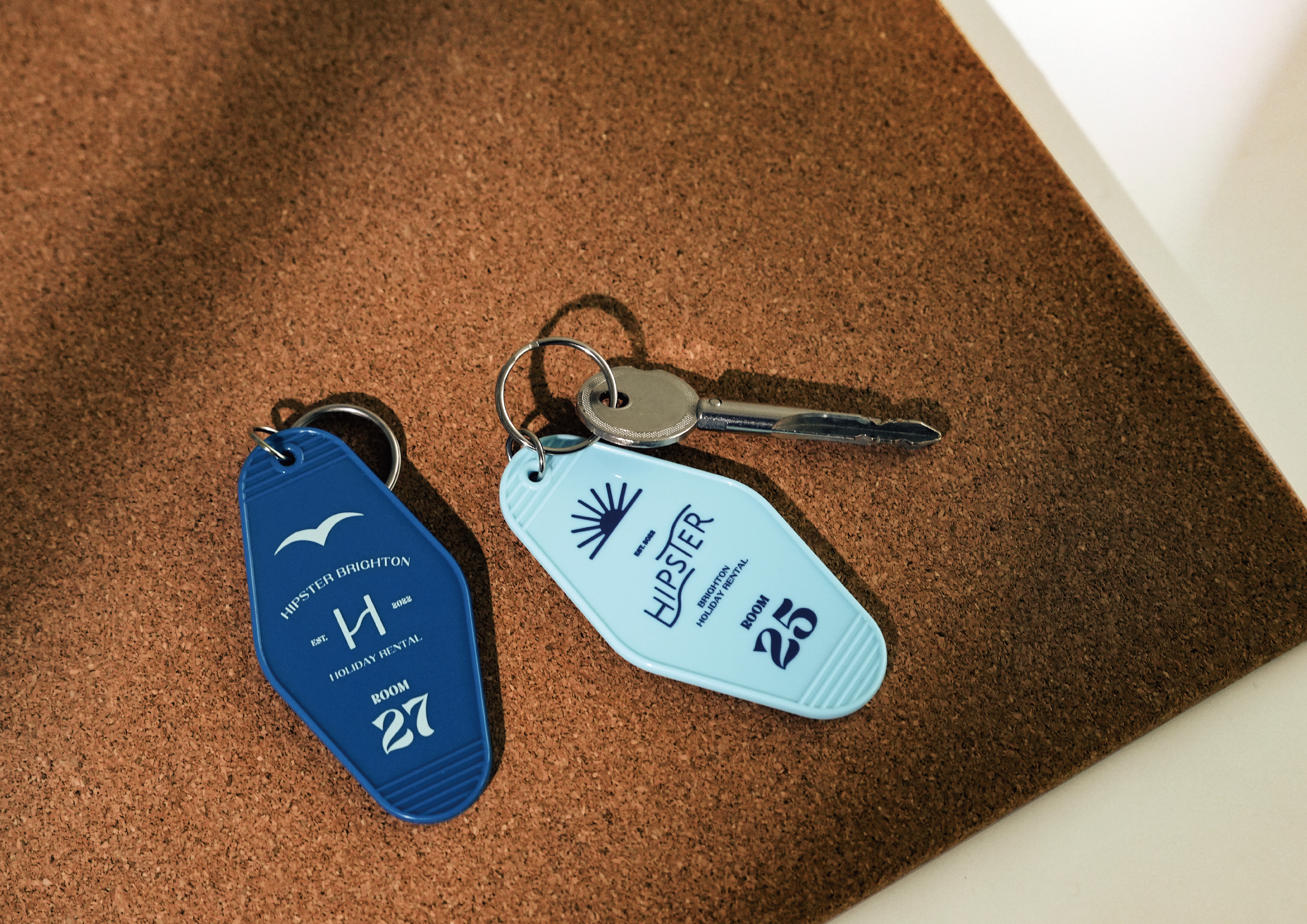
The brand colors draw inspiration from Brighton’s sea, featuring layered shades of blue, accented with sunset orange and sandy beige. The brand illustrations extend naturally into motifs like seagulls, sunsets, and ocean waves. We’ve also created a range of merchandise—such as postcards, keychains, and mugs—not only to enrich the brand image but also to offer travelers a more memorable, immersive experience.
Logotype 以簡練的黑體作為基礎、搭配有著粗細對比的襯線字,帶出 Hipster Brighton 當代中卻不失溫暖經典的氛圍。整體利用高底起伏的字體排列營造輕鬆愉快的心情,律動感的字體讓整體更像是在暖陽與寧靜海聲中隨之起舞。
品牌色以Brighton海洋的藍為主,帶出不同層次的藍色調,加以用夕陽橘色、沙灘米色作為點綴。品牌圖案延伸出海鷗、夕陽、海浪作為輔助,我們更製作出不同的周邊商品,如同明信片、鑰匙圈、馬克杯等等,增添品牌的形象外也希望帶給旅人更多的體驗。
A home where you harbour feelings from the journey.
Visual Identity
The logotype combines clean, minimalist sans-serif typography with contrasting thick-and-thin serif details, reflecting Hipster Brighton’s contemporary yet timelessly warm character. The playful arrangement of letter heights evokes a sense of lightness and joy, as if the typography itself were dancing in the gentle sunshine and soothing sound of ocean waves.
The brand colors draw inspiration from Brighton’s sea, featuring layered shades of blue, accented with sunset orange and sandy beige. The brand illustrations extend naturally into motifs like seagulls, sunsets, and ocean waves. We’ve also created a range of merchandise—such as postcards, keychains, and mugs—not only to enrich the brand image but also to offer travelers a more memorable, immersive experience.
Logotype 以簡練的黑體作為基礎、搭配有著粗細對比的襯線字,帶出 Hipster Brighton 當代中卻不失溫暖經典的氛圍。整體利用高底起伏的字體排列營造輕鬆愉快的心情,律動感的字體讓整體更像是在暖陽與寧靜海聲中隨之起舞。
品牌色以Brighton海洋的藍為主,帶出不同層次的藍色調,加以用夕陽橘色、沙灘米色作為點綴。品牌圖案延伸出海鷗、夕陽、海浪作為輔助,我們更製作出不同的周邊商品,如同明信片、鑰匙圈、馬克杯等等,增添品牌的形象外也希望帶給旅人更多的體驗。
C: HIPSTER BRIGHTON
CD:PHIL STUDIO
AD&D:YUF STUDIO
T:Positioning / Visual Identity / Copywriting / Collaterals / Digital curation
Y:2024
CD:PHIL STUDIO
AD&D:YUF STUDIO
T:Positioning / Visual Identity / Copywriting / Collaterals / Digital curation
Y:2024